Rubi Residencias Logo Design Is a Result of a Meticulous Precious Gem Study
Rubi Residencias, an Argentinian real estate agency, needed a branding overhaul, for which they sought the services of their compatriot design agency, 22DG.
Any branding effort begins with the logo and the agency didn’t miss in this regard. The result is a subtle yet elegant solution that communicates the premium and luxurious character of Rubi’s properties.
Having a name associated with femininity and, of course, the precious stone, the agency seized this opportunity to bond the two qualities into a remarkable, contemporary logo.
As such, the Rubi Residencias cool logo design is versatile as it is intricate — an interesting visual identity for a series of real estate projects. And because each housing estate requires a specific branding, it’s also a cornerstone on which all subsequent identities are based from.
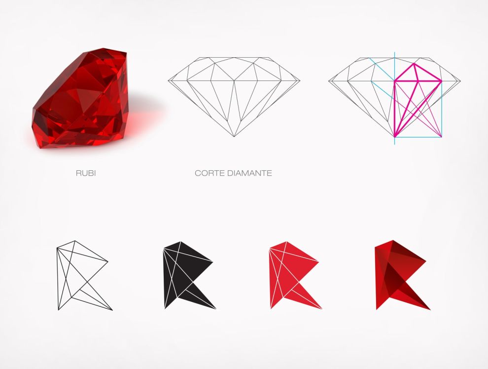
To do this, 22DG conducted a “detailed study of the precious gem” and created a concept for all brand communication. This research ensured an intelligent use of the rock’s structure and spectacular color to set it apart from logos in its niche.

The “R” in Rubi Residencia’s Logo Derives From the Structure of Rubies
The most striking evidence of this research is the somewhat abstract but still quite obvious “R” (that stands for “Rubi”). Essentially, this letter is the logo.
For its creation, 22DG looked into the complex, inner structure of precious gems like rubies and diamonds. Inside the “heart” of these rocks is the geometrical formation that gives life to numerous other forms – if you know where to look for them.
The design agency did and has sourced the letter R from this. To make the link visually apparent, the logo’s R has multiple flat surfaces that also resemble rubies.
Crimson Adds Liveliness to Rubi Residencia’s Logo Through Gradient Shades and Nuances
There was only one obvious choice of color for Rubi Residencias logo – blood-red crimson.
That, of course, is the color of the very stone inspired by the logo. Similar to how professional logo design agencies focus on a single color for maximum impact, crimson was given special treatment to captivate the gaze of onlookers.
The design agency has given it special treatment to make it stand out and captivate the gaze of onlookers.
Not settling for the exact vibrant shade of scarlet, the designers took the rock’s trademark shine and glimmer into account and gave the logo’s every “surface” a distinctive shade.
Multiple ruby red hues produce a similar outcome to looking at an actual rock from many angles, depending on how the light hits it.
The “after-effect” of this logo design approach is the introduction of a multidimensional or 3D appearance. While a logo in a solid shade of red may have appeared flat and insipid in some cases, the actual 3D logo translates the brand’s name and positioning much better.
Although it should be said that different 2D versions of the Rubi logo do exist — in white, black and solid red. Presumably, these are used in environments that don’t allow for many intricacies in design, adding to its versatility.

Simplistic Fonts Counterbalance the Exceptional Complexity in Rubi Residencia’s Logo Design
While the scarlet “R” is the main part of the Rubi logo design, another constituent – albeit of secondary importance – is the actual brand name that appears in some iterations of the logo.
Rubi Residencias is written in a very legible and straightforward sans serif font that aims not to distract from the vivid splendor of the logo. The real estate agency’s name is placed in two lines, just below the iconography. The name “Rubi” is featured in a more prominent, bold and larger sized font. Meanwhile, “Residencias” is placed below the separator line in a more lightweight typeface.
Since the Rubi logo will most often appear on its own, the design agency felt that the brand name should be as low-key and subdued as possible — a fine choice that lets the pièce de résistance that is the red “R” shine to its fullest.

Rubi Residencias Logo Design Exudes Exclusivity and Talks to the Sensibilities of the Modern Buyer
22DG’s logo design for Rubi Residencias captures the materialistic and symbolic essence of a precious gem to perfection. By taking every detail seriously, they were able to design a brand identity that is just as precious as the gem itself — at least to the real estate company’s branding efforts.
While quite clearly communicating the upscale, top-end character of the properties, the Rubi Residencias logo isn’t all that exclusive. By avoiding any classicist, traditional aesthetic cues akin to this particular niche of housing, it speaks well to the modern, younger consumer unaccustomed to such visual language. It showcases how a branding agency can tap into new markets by embracing a fresh visual approach. Explore the best real estate logo designs.
For this and all other reasons stated in this article, Rubi Residencias logo design deserves to win the Best Design Award for February 2022. Check out our article on best logos 2022.


