- Agency: Polar
- Client: Pulpo
- Category: Branding
- Location: Montevideo, Uruguay
- Project Brief: Deliver strategic brand and communication systems that combine visual identity, packaging, digital design, and advertising to help companies build distinctive market presence. Projects often extend across editorial, social media, and commercial strategy to ensure cohesive brand storytelling and measurable impact.
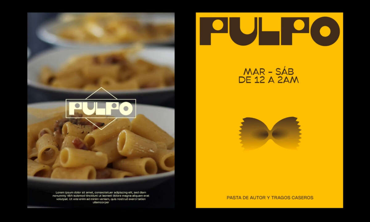
Restaurant branding must spark appetite and personality at first glance. Pulpo’s identity achieves this through bold geometric typography, a warm culinary color palette, and playful illustrations that reference pasta shapes and handmade craft. The result is a visual system that feels approachable, distinctive, and rooted in the spirit of a neighborhood pasta bar.