Team Behind the Design
Logo Design Analysis
In reviewing a health and wellness logo design, I look for concept clarity, typography, scalability, and application.
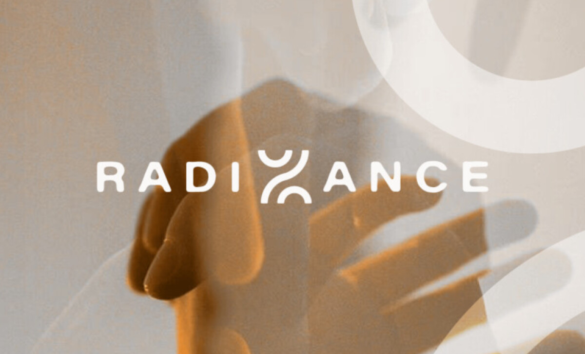
Strong identities balance symbolism with timeless form, and Studio Flowmo’s design for Radiance achieves that with ease.
- Symbolism: The dual curved strokes form an abstract expression of yin and yang, reflecting light and shadow, energy and stillness.
- Typography: The rounded sans serif wordmark conveys calm precision. Its even weight and open spacing echo the mark’s balance, creating a gentle rhythm that feels centered. It fits a holistic brand rooted in mindfulness and clarity.
- Color and Tone: A deep maroon grounds the identity and connects to traditional Chinese symbolism of life force and vitality. In embossed print, the color shifts subtly with light.
- Composition: In one logo version, I love how the designer placed the symbol within the word “RADIANCE.” With each curve and counterform, the logo is arranged to create a sense of calm order and quiet intention.
What Brands and Agencies Can Learn from Radiance
Studio Flowmo’s work for Radiance shows how subtlety and symbolism can shape a modern identity that feels personal and grounded.
1. Design Beyond Literal Representation
Abstraction often speaks louder than direct symbolism. By reimagining traditional icons through clean geometry, a brand can create a visual language that feels timeless, intelligent, and emotionally present.
2. Balance Energy Through Form and Space
Harmony in design comes from rhythm and proportion. The careful use of negative space and curvature gives a logo quiet movement and steady focus, allowing energy to flow without visual noise.
3. Let Restraint Build Meaning
Minimalism holds weight when every detail matters. Stripping color, texture, and typography to their core elements builds an identity that feels confident, calm, and deliberate.
About DesignRush Featured Designs
At DesignRush, we review hundreds of agency projects each month. The featured designs stand out for creativity, relevance, and execution.
Many go on to be recognized as winners of our Monthly Design Awards.
Discover more inspiring projects:
- Best Logo Designs
- Best Website Designs
- Best App Designs
- Best Print Designs
- Best Packaging Designs
- Best Video Designs
For a full list of design agencies and related services, see our Agency Directory.