- Agency: Pixels & Pulp
- Client: SABA
- Category: Logo - Airline
- Location: Portland, Maine, United States
- Project Brief: Create an airline logo for SABA that communicates collaboration, progress, and credibility while supporting its mission to achieve net-zero aviation.
When I look at airline logos, I focus on whether the mark can communicate motion, trust, and long-term vision while remaining simple enough to scale globally.
The SABA logo succeeds by embedding its aviation message directly into the wordmark and letting structure lead the identity.
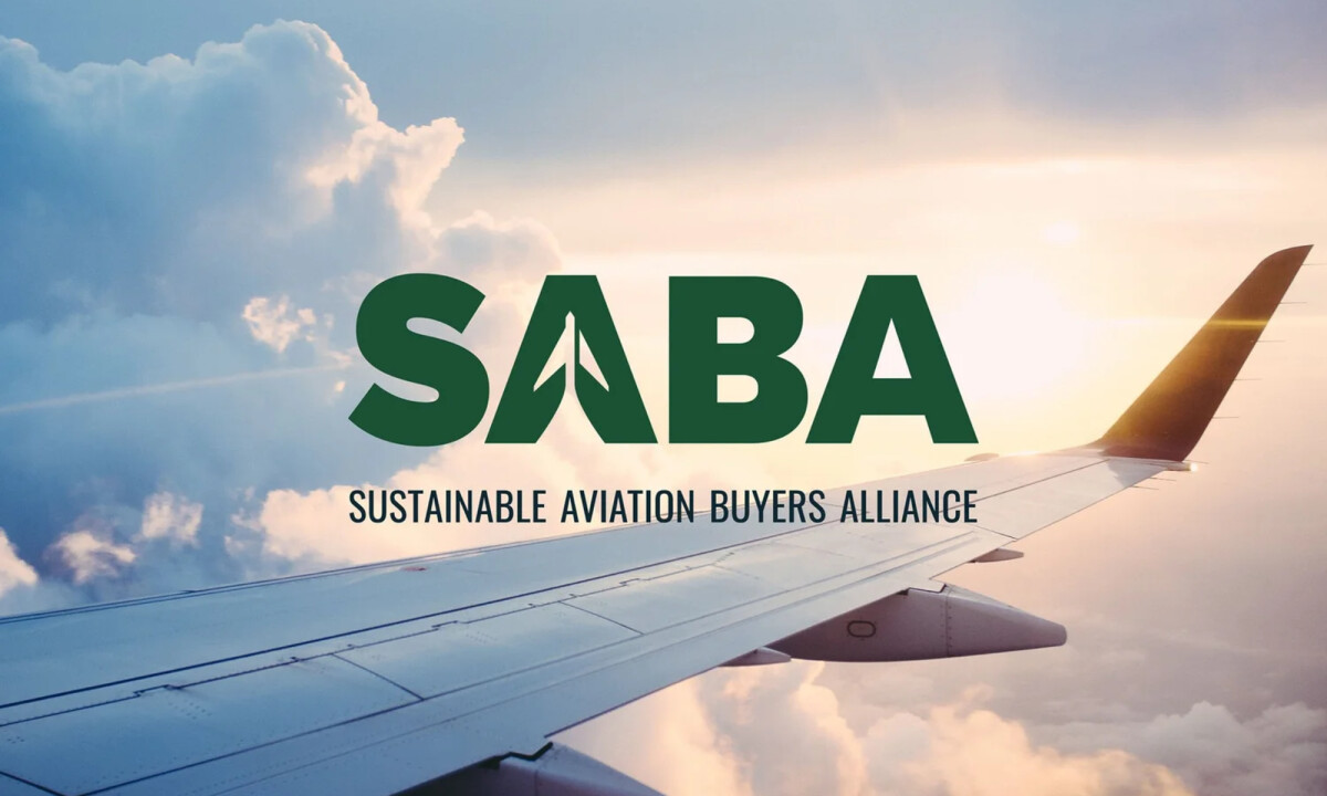
- Concept & Symbolism: I like how the customized “A” subtly suggests both an aircraft and upward movement. The symbolism feels intentional without becoming literal, which often helps logos age more gracefully.
- Typography: The bold, geometric sans-serif wordmark feels stable and institutional. This choice suits an alliance-level organization, and I like that the typography avoids trend-driven gestures. Its simplicity gives the identity longevity and reinforces a sense of seriousness and responsibility.
- Color: A deep green palette anchors the system with maturity and restraint. By avoiding bright, expected eco-signaling, the color feels credible and grounded. When placed against sky and cloud photography, it maintains contrast while supporting a calm, authoritative tone.
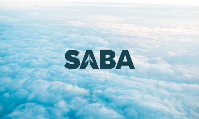
- Applications: I find the logo’s ability to live confidently on atmospheric imagery particularly strong. It suggests an identity designed for storytelling and leadership communications rather than just static brand assets.
What Brands and Agencies Can Learn from SABA
1. Build Meaning Into the Wordmark, Not Around It
Integrating industry cues directly into typography can create cleaner, more ownable logos while avoiding visual clutter.
2. Use Restrained Color to Signal Credibility
Deeper, grounded tones often communicate seriousness and long-term commitment better than overt sustainability palettes — especially in sectors like aviation.
3. Design for Image-Heavy Environments Early
Logos that remain legible in photography gain flexibility across digital storytelling, presentations, and large-scale applications.