Team Behind the Design
Logo Design Analysis
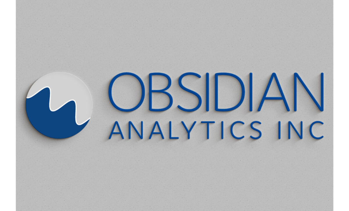
I see a logo as a company’s handshake. It should instantly tell you who they are and what they stand for without saying a word.
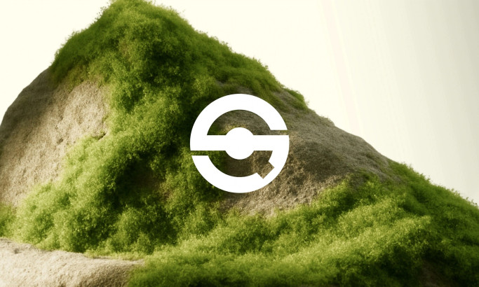
The mark for Obsidian Analytics Inc achieves this through clarity, structure, and thoughtful simplicity.
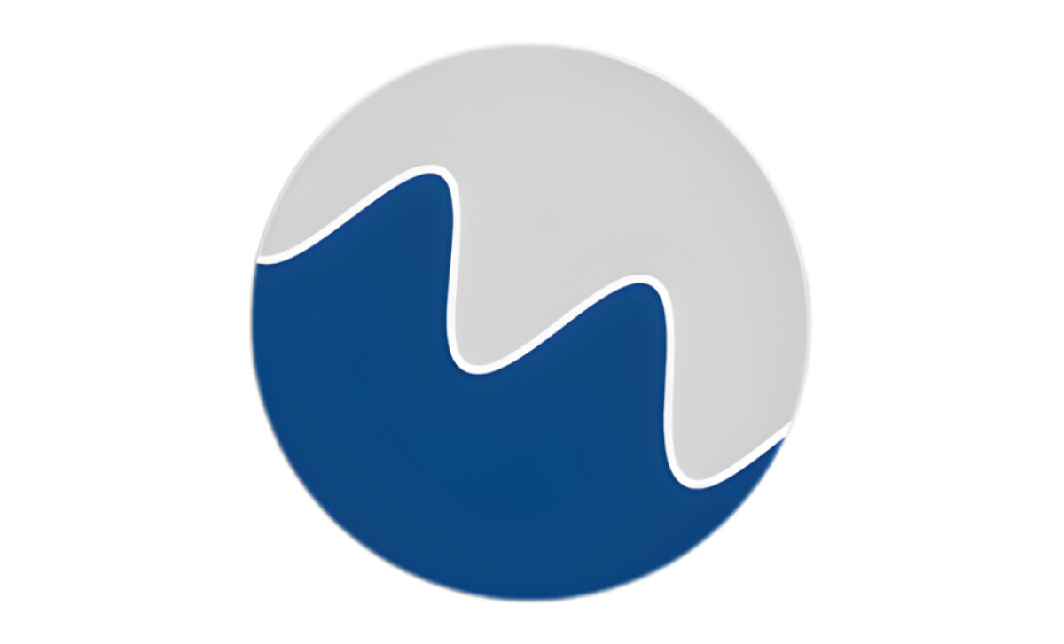
- Concept: The circular emblem suggests balance and continuity, while the wave form within it feels dynamic, hinting at movement and progress, which are key ideas for an analytics firm.
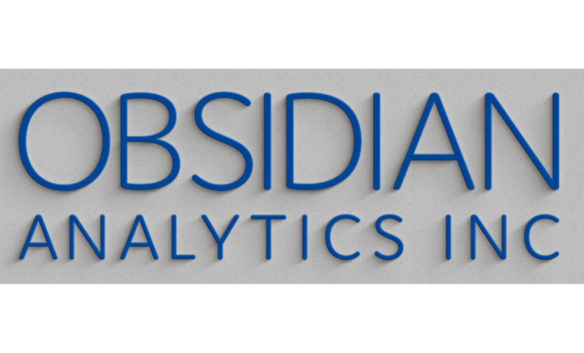
- Typography: I appreciate the sharpness of the sans-serif lettering. It brings confidence and professionalism, aligning well with the precision implied by the company’s name.
- Color: The deep blue conveys trust and intelligence, while the light gray adds balance and restraint. Together, they create a palette that feels dependable and sophisticated.
- Applications: The logo maintains strong legibility across print and digital formats. Its minimal detail ensures it remains crisp whether used on reports, websites, or signage.
What Brands & Agencies Can Learn from Obsidian Analytics Inc
Shira Heimann’s work for Obsidian Analytics Inc shows how precision and restraint can create a strong visual identity. Every detail serves a purpose, resulting in a mark that communicates confidence without noise.
1. Let Geometry Speak for Logic
The circular form and inner wave create balance and direction. This structure reflects analytical thinking, reminding designers that form can express the logic behind a brand’s work.
2. Build Trust Through Simplicity
The limited color palette and clear typography convey professionalism without excess. The design feels deliberate, showing that simplicity often builds more credibility than complexity.
3. Design for Adaptability
The logo performs consistently across media, from digital platforms to print materials. Its clean structure ensures longevity, proving that modern design can remain timeless when grounded in clarity.
About DesignRush Featured Designs
At DesignRush, we review hundreds of agency projects each month to uncover standout work in branding, digital, and visual design. The featured designs represent some of the most compelling executions, standing out for clarity, creativity, and technical precision.
Top-performing projects often advance to our Monthly Design Awards, gaining wider industry recognition.
See more creative projects across categories:
- Best Logo Designs
- Best Website Designs
- Best App Designs
- Best Print Designs
- Best Packaging Designs
- Best Video Designs
For a full list of design agencies and related services, visit our Agency Directory.