
A 16th-century monarch had one word cut from Spain's motto: nothing.
The royal banner used to read Non Plus Ultra (nothing further beyond), marking the edge of the known world. Then Columbus came back from a continent nobody in Madrid knew existed, and someone at court took a knife to it. What was left read Plus Ultra. Further beyond.
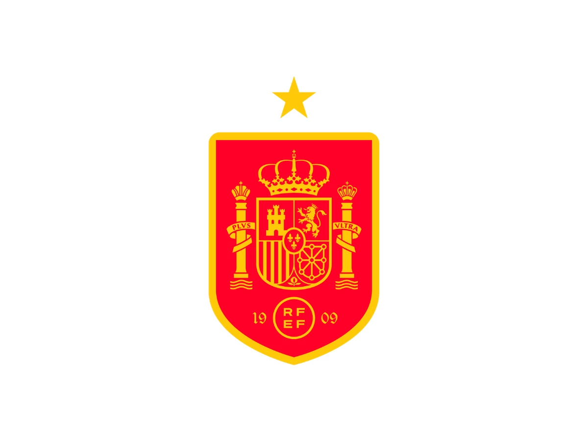
That edited motto is still stitched into Spain's national team crest, five centuries later.
Once you notice the badge is full of edits like this — old symbols quietly re-meant rather than replaced — the team's history stops looking like a design story. It starts looking like a story about who gets to decide what an old symbol means next.
The Federation Experiments, 1920–1935
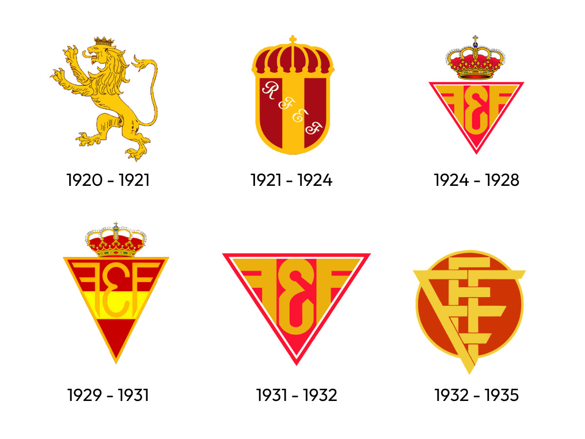
The full state coat of arms didn't arrive on day one.
Spain played its first official match at the 1920 Antwerp Olympics, and the crest on the shirt that day wasn't the quartered shield people associate with the team now.
It was a single lion, taken from the old Kingdom of León's coat of arms, and the federation seems to have designed it themselves. Nobody was handing this team an identity from above. They were inventing one on the fly, the way most young organizations do.
They kept at it for the next fifteen years. A crowned emblem followed, then a run of triangular badges stamped with the letters F.E.F., each version showing up a few years after the last through the late 1920s and into the '30s.
Read the sequence in order and it doesn't look like an institution refining its identity so much as one still auditioning for it, trying on shapes to see which one would stick.
What came next wasn't the next stage of that experiment. It was a different kind of authority altogether, one that didn't need fifteen years to decide what the crest should mean, because it had already decided before the war even started.
The State Takes Over, 1937–1981
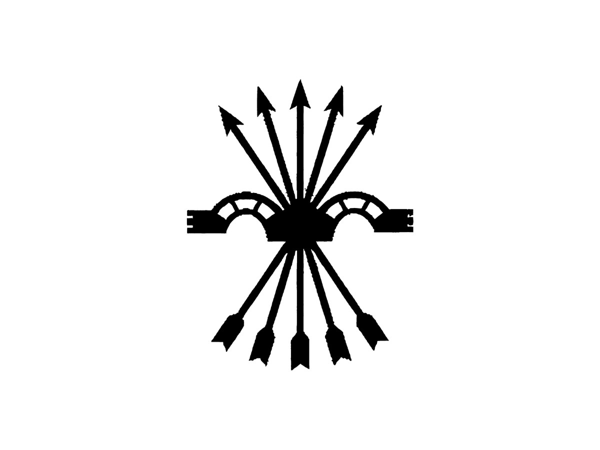
In November 1937, mid-civil war, Spain played a friendly against Portugal wearing the yoke and arrows, the Falange's emblem. It wasn't new.
It dated to Ferdinand and Isabella's marriage. A sheaf of arrows bound together, crossed by a yoke, the harness device used to bind a pair of oxen.
Ferdinand had taken the yoke as his personal badge, Isabella the arrows, and by the courtly custom of the time each device happened to echo the other's name, yugo and Ysabel sharing a Y, flechas and Fernando sharing an F.
The image did the real work, though. A single arrow snaps. A bundle doesn't. Franco's fascists picked up a four hundred year old royal symbol built entirely around that idea and put it to work for their party.
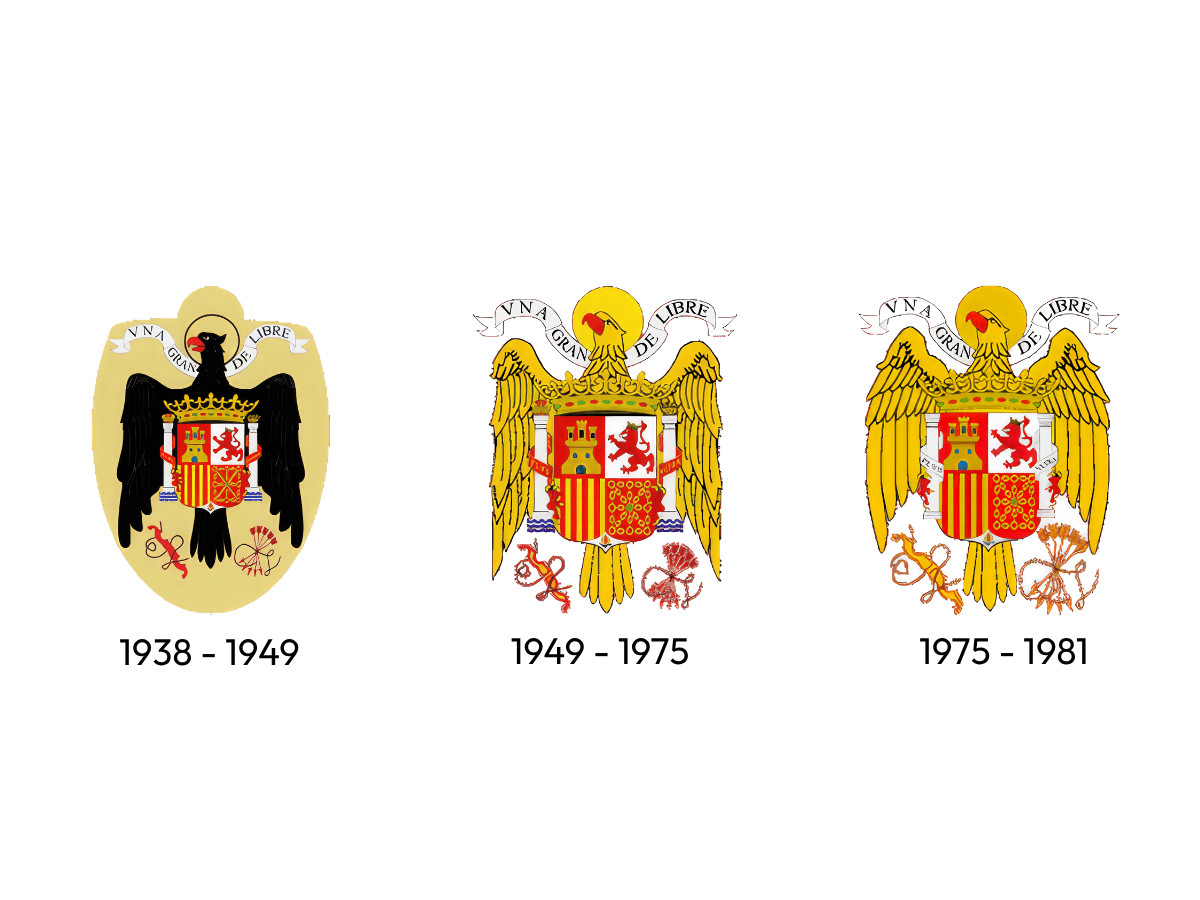
After the Nationalists won, the Spanish national team's logo design changed again, this time to the Eagle of Saint John, a black heraldic bird that had supported the arms of the Catholic Monarchs since Isabella's own reign. Around its neck hung a banner reading Una, Grande, Libre. One, great, free.
By 1949 the eagle had moved to gold, embroidered onto oval red patches sewn straight onto the jersey, ceremonial in a way its original heraldry had never asked to be.
None of this was really about a badge. It was about how propaganda tends to work in practice. Franco didn't need to invent a new symbol to sell his regime.
Inventing something is expensive, and people are naturally suspicious of anything they don't already recognize. So he took something five centuries old, something Spaniards already trusted without examining it too closely, and let it quietly argue for something it had never meant before.
Two decades of the federation experimenting with its own identity, the lion, the crown, ended the moment the state decided the crest wasn't the team's to shape anymore.
The eagle held its place through Franco's death in November 1975. Its wings were reshaped in 1975, part of a wider revision to the state's coat of arms in the early years of the transition, but the bird itself didn't leave the shirt until 1981, when Spain's parliament passed Law 33 of that year and formally adopted a new national emblem: the quartered shield of Castile, León, Aragon, and Navarre.
Most Spaniards saw that restoration happen on a football field before they saw it anywhere official. Not on a government building. On eleven men taking the field.
Restoration and the Long Wait, 1981–2005
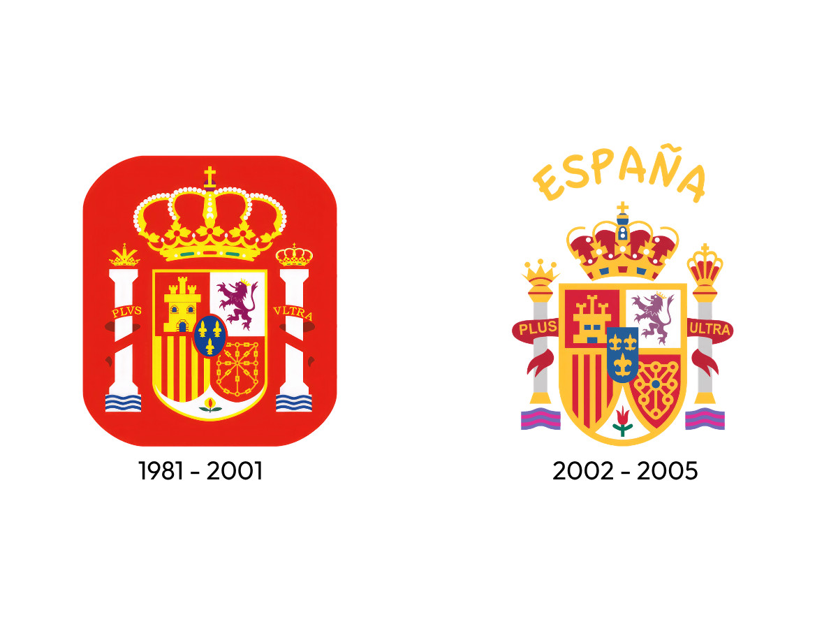
Even the restored shield carries pieces that do more work than they look like they should. Take the lion.
It reads as strength, the way lions tend to in heraldry, but León actually took its name from the Latin Legio, a Roman legion once stationed there, and heraldry needed some way to represent that name visually.
So the kingdom got a lion, not because lions meant León, but because the two words sounded alike. A thousand year old pun, still sitting on the crest, mostly because by 1981 nobody involved was actually designing this thing anymore.
They were just putting back what had been there before.
For two decades after that, the crest and the team told different stories.
Spain won the 1964 European Championship, lost the 1984 final, and generally didn't produce results that matched the weight of what the players were wearing.
Then in 2002, the word España finally got lettered above the shield. It reads like a minor addition, but it was the first time the crest said, in writing, that it belonged to a football team and not only to the state.
The Star Era, 2008–2021
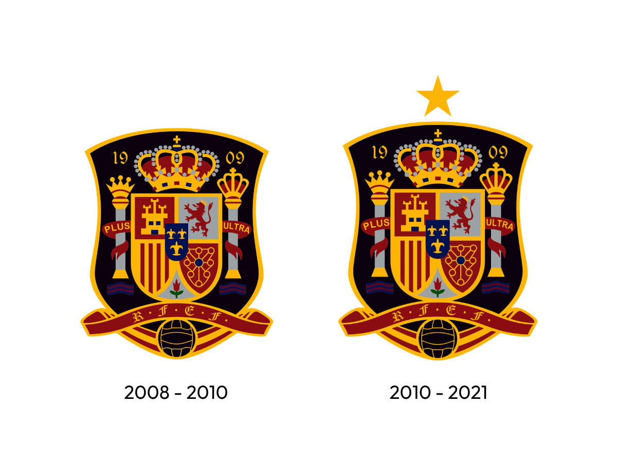
Andrés Iniesta scored in the 116th minute of the 2010 World Cup final, and the wait ended. Spain won its first World Cup.
A single gold star went up over the coat of arms a few months later, and for the first time in ninety years the badge had a fact of its own to point to, something the team had actually done rather than something the state had handed down to it.
Just one star, though, for five European Championships across six decades and a style of play, built around Xavi, Iniesta, and Busquets, that changed how the position game gets talked about internationally.
FIFA only awards stars for World Cup wins, so 1964, the 1984 final, 2008, and 2012 all add nothing to the shield. One star, for one afternoon in Johannesburg.
There's something strange about that kind of modesty coming from the most dominant international side Europe produced this century, and it runs opposite to what happened with the eagle decades earlier. This time, the smallest possible gesture turned out to be the honest one.
Simplification, 2021–Present
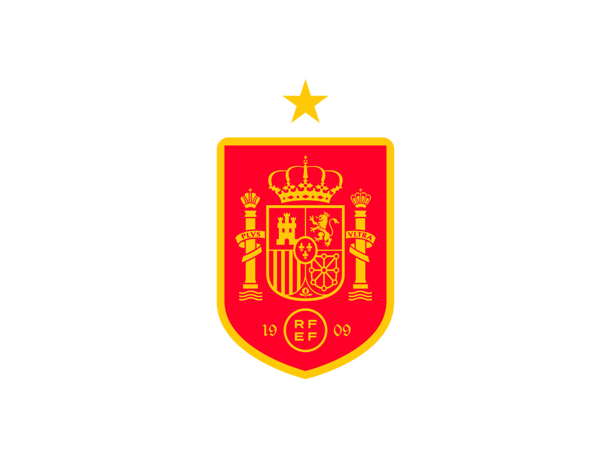
In March 2021, the RFEF rebranded, but only one of its two marks actually changed. The kit badge got streamlined slightly. The institutional logo, a Miró-derived abstraction the federation had used since the late 1980s, was replaced entirely with four letters inside a red circle.
Federation president Luis Rubiales said the new design was meant to project power and accompany future successes. What it got instead was widespread mockery online, including comparisons to a generic stock template and to a German pharmaceutical company. The shirt badge, the actual coat of arms, barely came up in the conversation at all.
That's not an accident. You can replace a logo that's three decades old and mostly administrative and expect almost nobody to notice, and almost nobody who does to care enough to fight about it.
You can't casually replace a symbol that has outlived seventeen governments, survived a dictatorship, and been quietly re-meant more than once without anyone formally announcing it.
The RFEF found that boundary by walking straight up to it. Touch the disposable mark and you get a rough week on social media. Touch the other one and it stops being a design story altogether.
What's On the Spanish National Football Team's Logo?
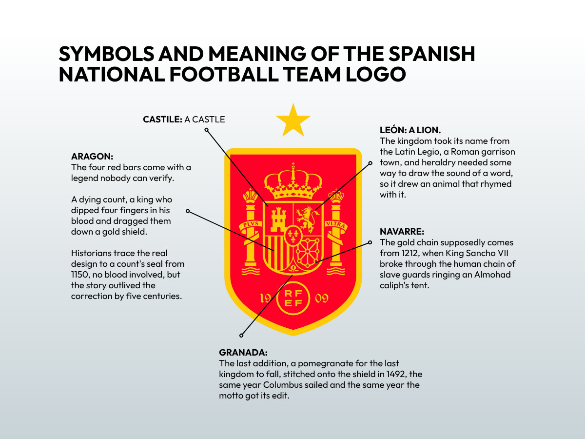
Every symbol on the Spanish national football team logo design predates the sport by centuries, borrowed whole from four defeated kingdoms and one addition, each with its own story.
The castle stands for Castile. The lion, rearing with its tongue out, stands for León, and still carries that thousand year old pun from Legio. The vertical bars stand for Aragon.
The chain running diagonally in gold stands for Navarre. At the base sits a pomegranate for Granada, the last of the old kingdoms to fall, added to the arms in 1492, the same year Columbus sailed and the same year the motto got its edit.
None of it was designed with a football shirt in mind. All of it was designed for a country, centuries before Spain fielded a team, and the team simply inherited the job of wearing it.
Two columns flank the shield, the Pillars of Hercules, each topped with its own small crown and wrapped in a ribbon that reads Plus Ultra.
Above the shield sits the royal crown, doing the same job it did on Franco's eagle and on the federation's earliest crowned badge: marking the crest as belonging to the state rather than to whichever government happens to be running it.
Only two things get added to that inherited coat of arms to turn it into a football badge instead of a government seal. There's 1909, the year the federation's forerunner organized, and a small monogram reading RFEF.
And there's a single gold star above the shield, for 2010, the one result on the crest that the state arms can't claim credit for. Everything else on the badge predates the sport. The star is the only part of it the players actually earned.
That's worth sitting with for a second, because it says something about restraint.
A federation that had just watched Franco stretch a five hundred year old eagle into a symbol for fascism, then spent six years after his death carefully unwinding it, seems to have learned something from the experience: symbols inherited from the state are borrowed, not owned, and the only addition you get to make without asking anyone's permission is the one you actually win.
Everything else on the shield belongs to Spain. The star belongs to the team.
What Comes Next
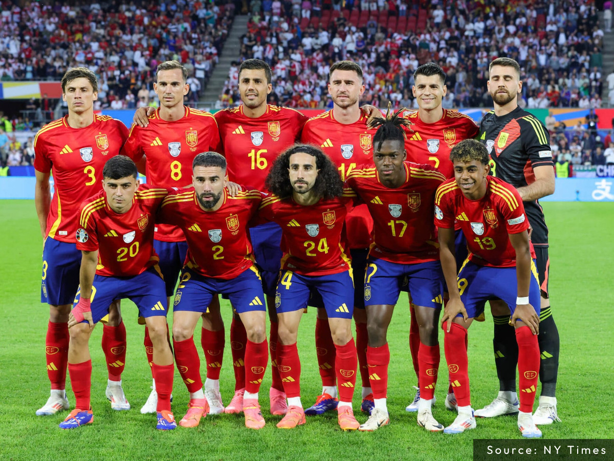
2026. Spain reached its first World Cup semifinal since winning the tournament outright in 2010, facing France in Dallas on July 14 for a place in the July 19 final.
Getting there took the kind of defense the shield has always implied and rarely had to prove: six straight matches without conceding, the longest run of its kind in World Cup history, before Belgium finally broke it in the quarterfinal, in a game Spain still won.
Whatever happened in Dallas, the shield itself doesn't change. Same lion, same columns, same word that's been missing from the motto since 1492.
The Spanish national football team logo was never entirely the state's to hand down.
For its first two decades, it was the federation's own experiment: a lion, a crown, a name with Real quietly added and then just as quietly taken away.
What's actually shifted, over more than a hundred years, isn't only the badge. It's who got to decide what it meant, and when the team stopped being the one deciding.

Spain didn't design most of its logo. It inherited a coat of arms built for a country, centuries before anyone put it on a jersey, and spent a hundred years figuring out how much of that inheritance still applied.
Most brands don't get that kind of runway, and most shouldn't want it. A logo built today has to earn its meaning from scratch.
If that's the identity you're building, our Agency Directory can connect you with the team to build it:
And if you’re curious for more inspiration, don’t miss our other features on standout logo designs in sports.