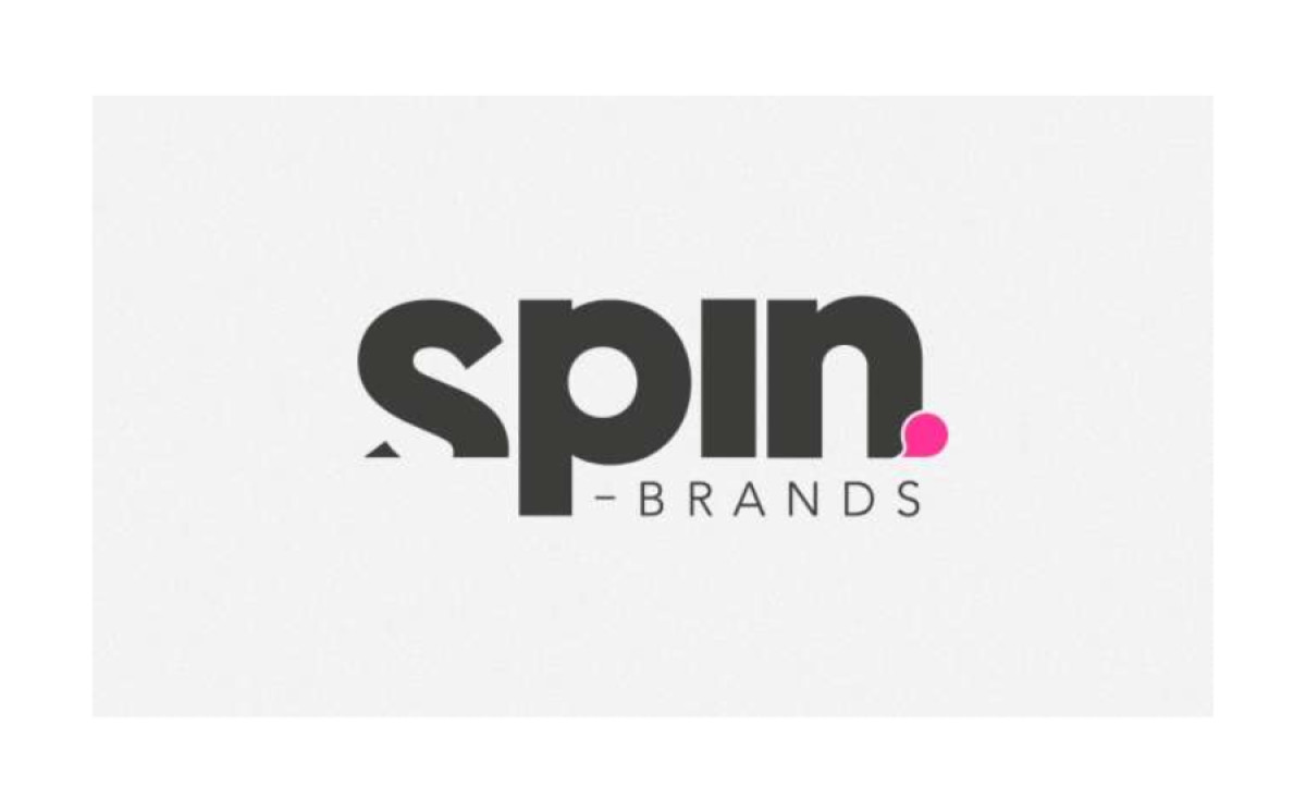
Standout Features:
- Bold and vibrant wordmark
- Integrated magenta speech bubble
- Complementary font pairing
Spin Brands, a social media agency that constantly evolves, needed a fresh face for its newfound demographic. Pithy Studios stepped in to rework the company’s branding, especially the logo – and did it so remarkably.
The designers ditched the old image and created a new visual identity that looks more eccentric, dynamic and modern.
From the multicolored loop logomark, they replaced it with a “Spin” logotype that’s written in a bold and wide font style. In contrast to this, the word “Brands” is written in a more subtle typeface to balance it out and drive the focus back to the main wordmark.
A magenta speech bubble also sits beside the brand name like a punctuation mark. Why a speech bubble? It’s a visual representation of their ability to keep the conversation going!


