Standout Features:
- Creative “C” framing
- Meaningful Christian symbolism
- Dynamic emblem with symbolic lines
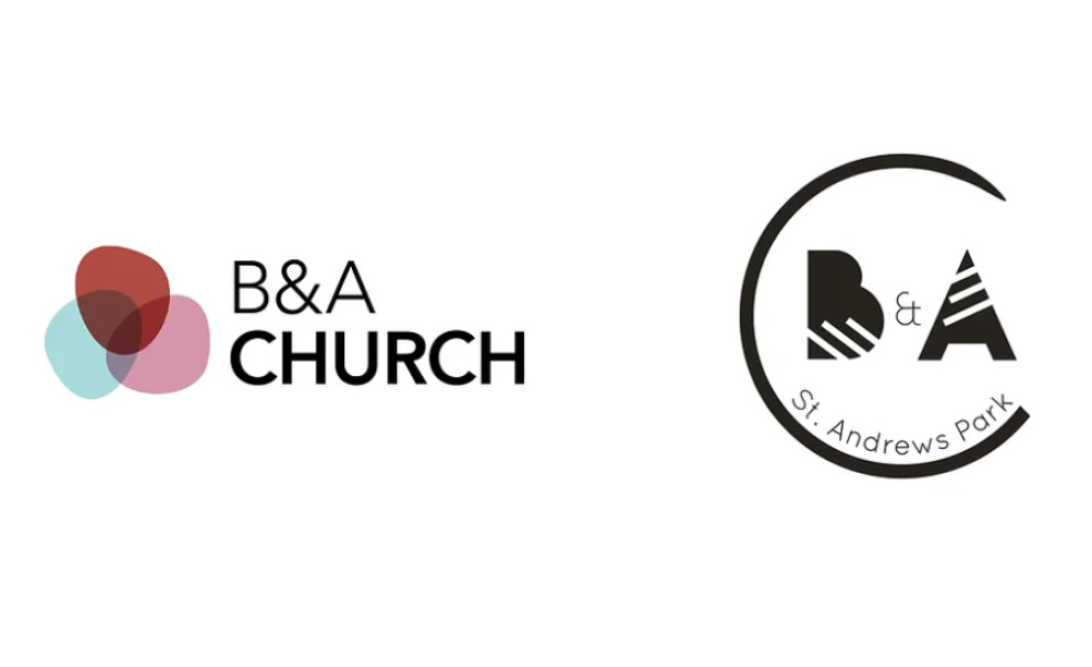
Mad About the Brand delivered a compelling rebrand for B&A Church, intertwining modern design with deep symbolic meaning.
The reimagined logo features the church’s initials, "B&A," rendered in large, bold typeface. These initials are crossed by diagonal lines that symbolize the church's mission of inclusivity and outreach. The lines also represent the divine light of God and the church's spiritual foundation.
The design includes a variation where the letter “C” gracefully encircles the initials, connecting the logo to Christ. This design choice deepens the symbolic connection and emphasizes Christ’s encompassing presence within the community.
Get a chance to become the next Design Award winner.
SUBMIT YOUR DESIGN


