Team Behind the Design
Logo Design Analysis
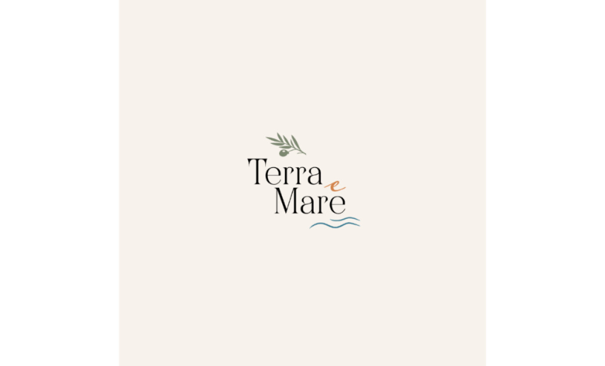
A logo for a restaurant like Terra e Mare must communicate atmosphere before a guest even steps inside.
Sparkle Creative Studio achieves that with a design that feels fresh, coastal, and quietly refined, much like the dining experience it represents.
Here’s how the design captures that harmony of land and sea:
- Concept: The logo brings the idea of “land and sea” to life through natural imagery and balance. I like how the olive branch and wave motif mirror the restaurant’s dual inspiration: the rustic warmth of the earth and the freshness of the coast.
- Typography: The serif type has gentle proportions that give it sophistication without stiffness. The lowercase e in a warmer hue adds a subtle point of personality, drawing the eye and softening the composition.
- Color Palette: Muted greens, terracotta, and sea blues recall Mediterranean landscapes and sunlit water. These tones feel inviting and organic, giving the identity a sense of calm and authenticity.
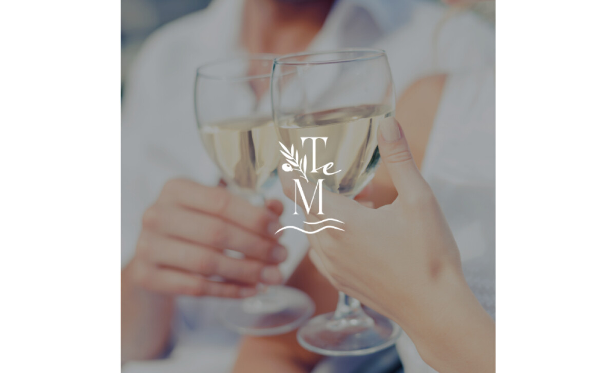
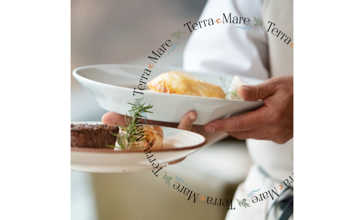
- Application: Whether displayed on glassware, menus, or photography, the logo retains its poise. The monogram version (T–M) works beautifully in close-up moments, while the circular lockup feels tailored for branding materials and digital use.
What Brands & Agencies Can Learn from Terra e Mare
Terra e Mare’s identity shows how thoughtful symbolism and refined design can express both heritage and warmth within hospitality branding.
1. Build Meaning Into the Motif
Use visual elements that tell the brand’s story at a glance. Natural imagery such as olive branches or waves can reflect the restaurant’s origins and connect its atmosphere to the Mediterranean coast.
2. Let Typography Set the Tone
Choose typefaces with balanced proportions that feel elegant without being overly formal. Small details like a color-accented letter or subtle curve can bring personality and make the mark feel distinctive.
3. Use Color to Convey Atmosphere
Draw inspiration from nature through gentle greens, soft terracotta, and muted blues. These tones create a calm, sunlit feeling that mirrors the restaurant’s inviting coastal spirit.
About DesignRush Featured Designs
At DesignRush, we review hundreds of agency projects each month. Logos like Terra e Mare’s stand out for their clarity, symbolism, and attention to tone.
The strongest entries often advance to our Monthly Design Awards as industry-recognized benchmarks of design excellence.
Logo design in the hospitality industry often captures both atmosphere and emotion through minimal, meaningful visuals. Discover more examples here:
- Best Logo Designs
- Best Website Designs
- Best App Designs
- Best Print Designs
- Best Packaging Designs
- Best Video Designs
For a full list of design agencies and related services, see our Agency Directory.
-preview.jpg)
