Best Logo Designs excite me. They bring to me an electric visual eclectic medley of tiddling joy. Sure, eclectic may not belong there, but it sounded great. Moving on.
This is the logo of ARA. ARA is a project consisting of rural creative routes established in amongst the vineyards of Rovigo, a small town in the north of Italy. That’s a spicy meat-a-ball (don’t worry, I can say that, I’m Italian). The logo was conceived via Identity Atlas - Ida Srl agency.
Their goal? Create not just a logo, a dynamic one. One that conceptualized the catharsis of movement. Something fluid. The glyphs were to make up the word ARA.
Before we delve into what makes this an example of best logo design, let us first ask: What is ARA, really? ARA‘s mission is to be a project of discovery. The extra-urban territory of Rovigo is interrupted by cycle-pedestrian routes. ARA brings awareness to the gorgeous countryside, thus, proposing a new approach to the land and an unprecedented experience of running and walking in evocative places. This also decreases traffic congestion, increases exercise and makes running very fun.

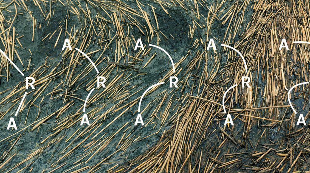
ARA encourages movement and activity. Take a look at this logo. Each letter connected by a curvy route that makes it look like it is moving. It is a matrix with three lines and three columns. These are not just merely glyphs. These lines go much deeper. The best logos are like onions, each layer revealing more complexity. We have another onion, folks. Let’s peel it.
The lines are in fact Bezier quadratic curves. These curves are primarily used in animation and user interface; they enable smooth trajectory from point A to point B, much like project ARA enables for its participants. They also allow the logo to be literally, more dynamic. The logo can be easily altered which create variations to exploit via different visual outputs. Poster, digital, postcard, app, email, your shoe... it can fit anywhere on any surface and still retain the iconic feel.
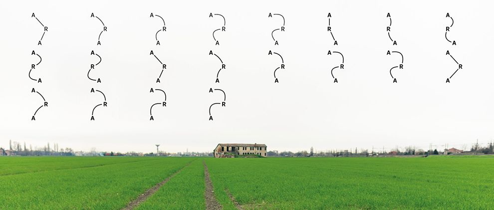
Look how awesome the logo looks amidst the country side of Italia. The juxtaposition between vintage Italian country side with lush green colors and a modern logo created with state if the art computing applications looks amazing.

The logo also features a communication system that uses various pictographic icons. These symbols can be used as marks revealing the various driving forces of the project which include sport, culture, social innovation, economics, rural life, and tourism. The colors used decline the desaturated colors of the reference area. They stand out.
What we have here is a logo that is gorgeous. It is fluid. It moves. This is a dynamic motion packed punch that will jolt forward runners forth through their path to discover new territory via project ARA routes. It is memorable. Have you ever seen a logo like this? It sticks. The best logos use this visual symmetry and contain the fewest elements, but are the deepest in meaning. On your mark, get set, GO. Project ARA is set to lift off. Buon note!
ARA is one of the best logo designs in the Sports & Leisure industry.