Team Behind the Design
Logo Design Analysis
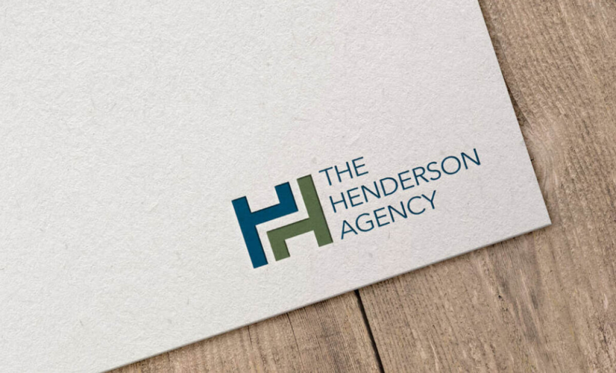
When I review emblem logos, I look for a strong concept and practical application. This design from Perched Owl delivers.
- Concept: The design fuses two 'H' initials into a balanced emblem. This fusion creates a strong visual anchor that feels professional.
- Typography: A clean font supports the emblem, making the overall look approachable yet maintains its authority.
- Scalability: The logo holds its clarity at any size. This quality makes it effective across all business materials.
- Applications: The design's structure allows for great flexibility in any color format across different media.
What Brands & Agencies Can Learn from Henderson Agency
This emblem design is a strong lesson in how to build a professional and flexible identity from a simple monogram concept.
1. Fuse Your Initials
You can create a memorable symbol by merging a company’s initials into a single, balanced shape. This approach turns a simple monogram into a unique emblem.
2. Let the Emblem Lead
When your logo includes a strong central icon, the accompanying company name should use a clean, understated typeface to avoid visual conflict.
3. Design a Color-Independent Mark
A strong logo is not defined by its color palette. The design’s core strength should come from its fundamental shape. This ensures the mark is recognizable even when produced in a single color.
About DesignRush Featured Designs
The designs we feature showcase leading creativity and expert delivery. Each stands out for its originality, precision, and ability to move brands forward.
The very best among them are celebrated through the Monthly Design Awards.
Check out more standout work across categories:
- Best Logo Designs
- Best Website Designs
- Best App Designs
- Best Print Designs
- Best Packaging Designs
- Best Video Designs
For a full list of design agencies and related services, see our Agency Directory.