Standout Features:
- Playful, colorful typography
- Fun, approachable design style
- Strong brand personality
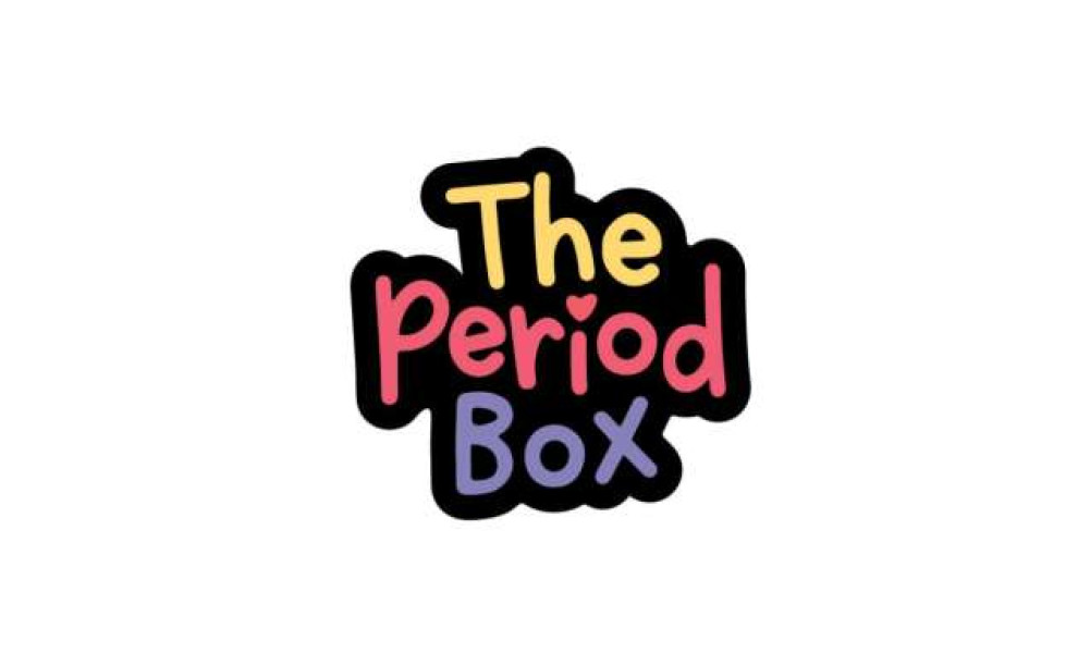
The Period Box is a health and wellness brand offering curated products to support individuals during their menstrual cycles. Their logo, designed by Little Black Kat Creative, helps position the brand as a fun and inclusive alternative in an often-stigmatized market, reflecting their mission to normalize menstruation.
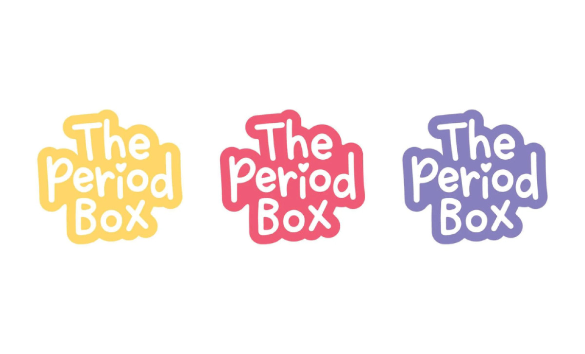
The colorful typography is one of the logo’s standout features. Each letter is a different bold color — yellow, red, and purple — giving the brand a playful, cheerful look. This vibrant design instantly communicates an approachable, light-hearted tone that invites customers to engage with the brand in a positive way.
The design also emphasizes approachability through soft, rounded letterforms and a heart accent in the word “Period.” These elements make the brand feel welcoming, reinforcing its supportive, non-judgmental stance toward menstruation. The logo helps to create an emotional connection with the audience, fostering a sense of care and inclusivity.
The bold typeface adds confidence to this health and wellness logo. It communicates strength and clarity, aligning with The Period Box’s mission to normalize and celebrate menstruation. The logo design ensures that the brand’s message is easily visible and stands out in a competitive market.
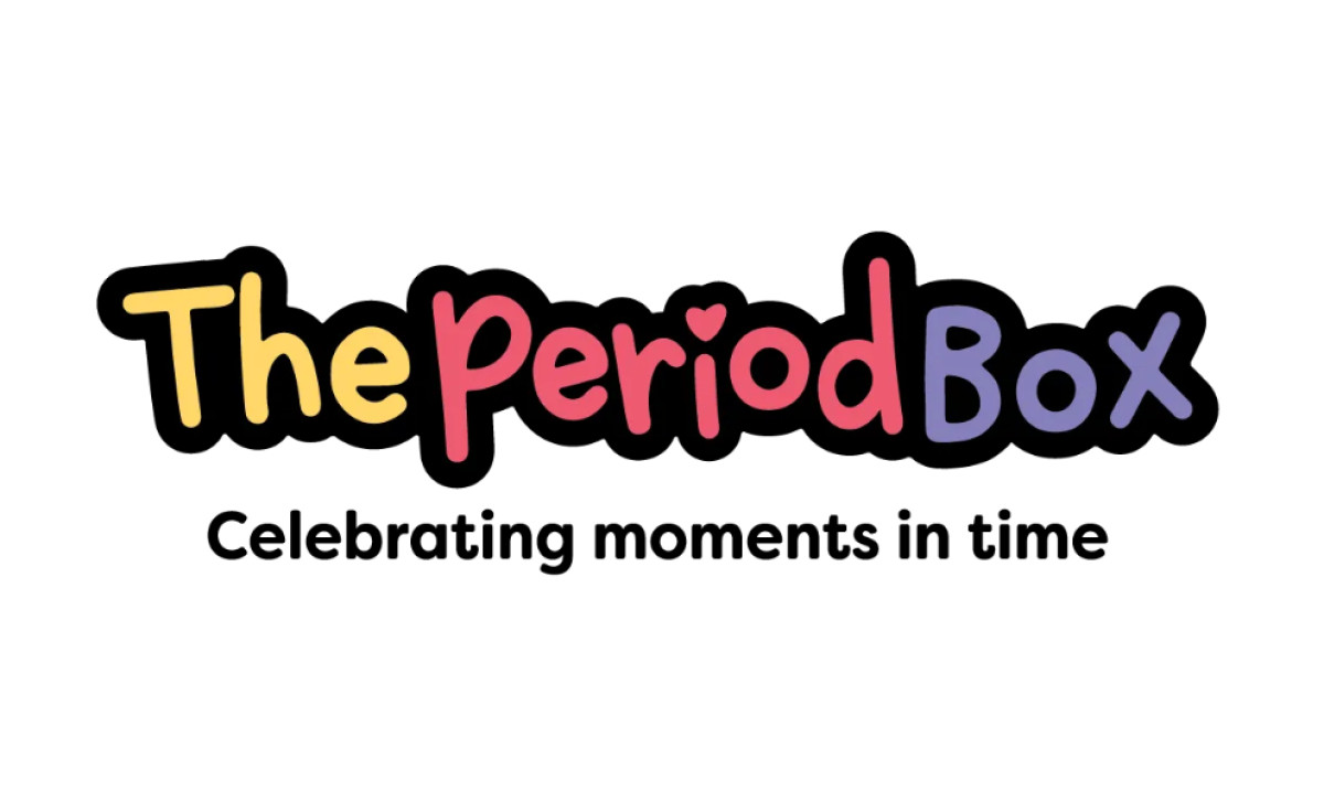
In conclusion, The Period Box’s logo successfully combines playful typography, a bright color palette, and warm design elements to reflect the brand’s inclusive, supportive, and confident personality. This design is key in conveying the brand’s mission to break taboos around menstruation while fostering an emotional connection with its audience.