Standout Features:
- Magnified effect
- Circle enclosure
- Minimalist and vintage vibes
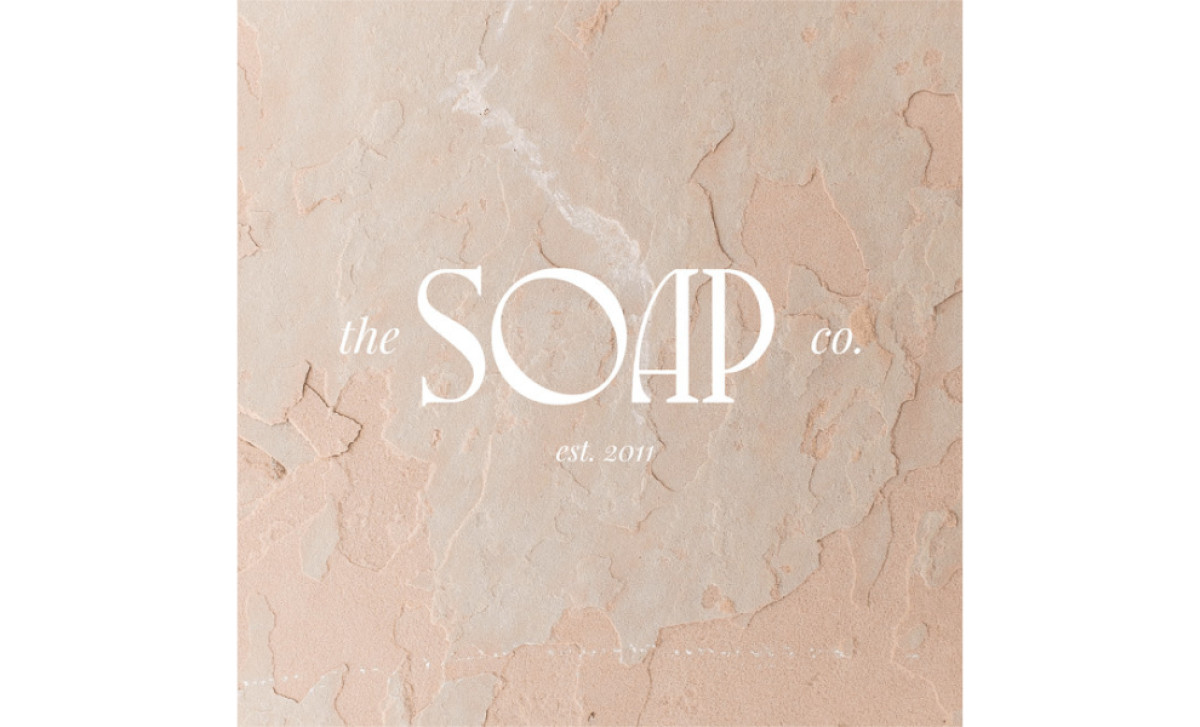
Rebecca Lee Creative's beauty product logo design for The Soap Co. includes minimalist and vintage elements. The circular logo has a magnified effect, adding a touch of playfulness to the otherwise clean and professional look.
The minimalist design, fine lines, and a neutral pastel color palette provide a modern yet timeless appeal. The concept of “less is more” is common in logo designs, and this logo nailed it effortlessly.
Get a chance to become the next Design Award winner.
SUBMIT YOUR DESIGN