Team Behind the Design
Logo Design Analysis
When I review technology logo designs, I look for clarity, structure, and whether the mark can scale across complex digital environments.
The V61 Tech logo succeeds by letting precise geometry and symbolic direction communicate trust and alignment.
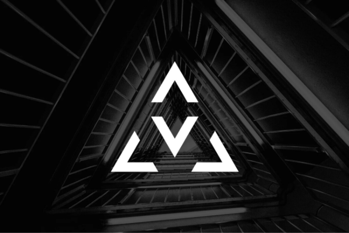
- Concept & Symbolism: Three arrow-like V forms come together to create an equilateral triangle. I like how this structure signals balance and equal partnership right away, while communicating V61’s intermediary role without relying on text, which feels right for a technology brokerage.
- Geometry: Tight spacing and sharp angles give the mark a disciplined, engineered feel. I’m drawn to how this level of control supports credibility in a category where trust matters from the first glance.
- Color Strategy: Neutral blacks and greys set a professional base, with yellow used sparingly for emphasis. What stands out to me is how the accent adds energy without pulling attention away from the form.
- Scalability & Versatility: Solid shapes and clear negative space help the logo scale cleanly across print and digital use. I appreciate how it stays recognizable in monochrome and high-contrast settings, which keeps the system flexible over time.
What Brands & Agencies Can Learn from V61 Tech
1. Let Structure Carry the Story
Thoughtful geometry can communicate complex relationships through form alone. When meaning lives in the structure, brands explain themselves quickly and with confidence.
2. Use Color as a Signal, Not Decoration
A restrained palette sets a professional tone, with a single high-contrast accent adding focus. This keeps attention sharp while preserving credibility in technology-led categories.
3. Design for Scalability from Day One
Logos built on clean shapes and clear negative space adapt easily across screens and print. Planning for flexibility early makes growth feel smoother as touchpoints expand.
About DesignRush Featured Designs
At DesignRush, we evaluate hundreds of projects each month. Featured selections stand out for clarity, craftsmanship, conceptual depth, and execution across digital and brand experiences.
The strongest examples move on to our Monthly Design Awards, highlighting best-in-class creative work.
Check out more standout work across categories:
- Best Logo Designs
- Best Website Designs
- Best App Designs
- Best Print Designs
- Best Packaging Designs
- Best Video Designs
For a full list of design agencies and related services, see our Agency Directory.

