Trifecta's Logo Promotes a Holistic Lifestyle with a Minimalist Design
As a brand focusing on healthy and sustainable lifestyles, Trifecta aims to inspire and motivate people from all walks of life with its impressive array of health products.
The brand wanted to ensure that all its visual assets, including the logo, reflect its sustainability and holistic living ideals.
This is where Migration Marketing comes in. The agency created a simple yet meaningful design, using symbols and shapes to signify the brand’s values. From the font down to the colors, the logo’s components align with what the brand promotes.
Although it's a ruling trend across various design projects, professional logo designers find minimalism ideal for brands in the health and wellness industry, as they often prioritize efficacy and performance through their visual elements, while communicating grace and elegance. In short, Trifecta's logo design fits perfectly at home.
In addition, its versatile design allows for flexibility, from websites to print and packaging designs.
Look at some more examples of simple logo designs here.

Trifecta's Logo Design Conveys Meaningful Messages Through Delicate Shapes
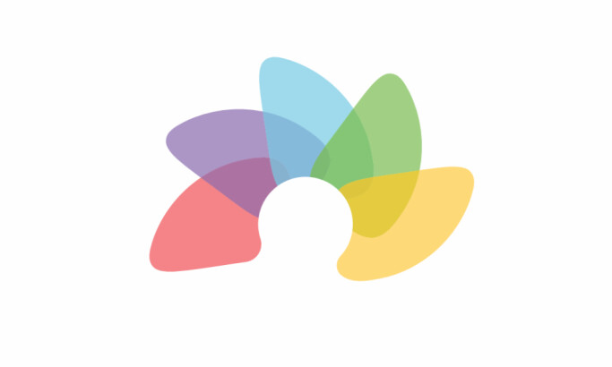
Branding agencies often use symbolism to convey deeper meanings and create memorable brand identities. In Trifecta's logo design, the three teardrop shapes forming a blooming lotus flower represent the interconnectedness of mind, body, and soul.
While the blooming lotus flower signifies the healthy collaboration between these three integral parts of humans, conveying holistic growth and development.
Lotus flowers are often associated with enlightenment in many Asian cultures, making it a perfect representation of what Trifecta wants to achieve: growth and development for everyone.
The empty spaces in the lotus flower shape also refer to the areas that Trifecta aspires to fulfill in their customers' lives.
The Logo’s Cool and Calming Color Story Complements the Brand’s Ideals in Trifecta's Logo Design
Trifecta's color story is unique, with shades like white, brown, and green representing the mind, body, and soul.
White symbolizes purity and cleanliness, and green signifies freshness and growth. Meanwhile, brown refers to the warmth and security that the brand wants to relay to its customers through its high-quality products. Brown also conveys wholesome feelings aligned with the brand identity and values.
These colors are perfect for encapsulating the holistic approach to wellness by Trifecta. Since the brand wants to be portrayed as one that wholeheartedly cares for its customers' overall health, the color story promptly sets a tone for that.
Green, brown, and white are also prominent colors in nature, as seen on the white clouds, lush greens from plants, and the brown soil of the Earth. This is the agency’s way of connecting the client’s commitment to sustainability, another essential part of its identity.
Overall, the colors blend harmoniously to reflect the brand's message.
Check out some of the other successful abstract logo designs here.

Thin Sans-Serif Fonts Relay Trust and Personality to Trifecta's Logo Design
The designers used thin sans-serif fonts to spell the brand name in bigger sizes, with the words "mind, body, soul" underneath in smaller font sizes.
The font style is perfect for readability, as it is thick enough to be read legibly by the audience without losing anything in the design.
Designers use fonts to convey feelings and thoughts that fit perfectly with the brand and the designs. Sans-serif fonts often relay thoughts of security, seriousness, and safety. Similarly, Trifecta aims to assure its customers that they get the best quality from their products.
In addition, the edges of the letters are a bit pointed, reminiscent of the stems and twigs in trees. Again, this is another clever nod to their advocacy of loving nature.
Text sizing also helps differentiate the product from its description. The bigger font makes the brand name stand out, while the smaller font indicates what the product claims to deliver.
The words mind, body, and soul are also connected with plus signs, indicating that this is the perfect equation for living a holistically healthy life. That said, Trifecta can help you achieve that with its impressive line of products.
Indeed, Trifecta's logo design is a successful one that effectively sends the right messages to its target audiences.