Standout Features:
- Interlocking circles symbolism
- Bold, modern typography
- Professional and trustworthy color palette
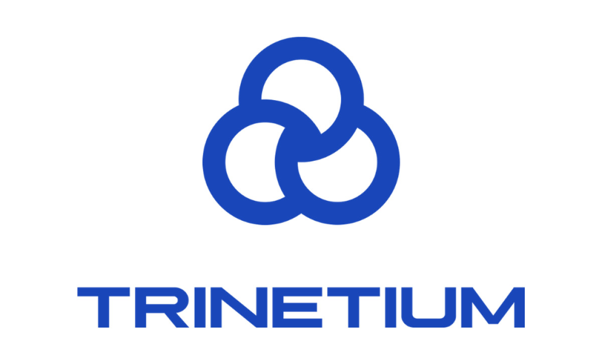
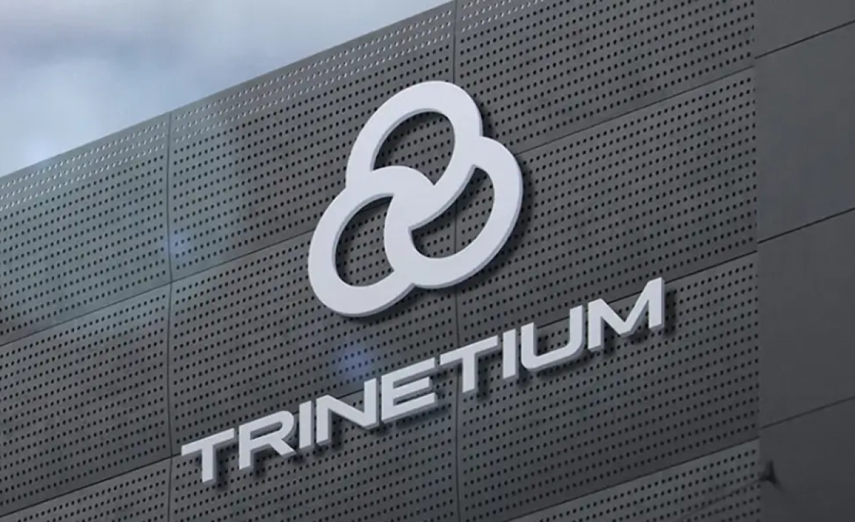
Trinetium is a travel technology company focused on providing innovative solutions to the travel industry, making the travel experience smoother and more efficient for travelers worldwide. The brand’s logo, designed by Spinners Creative Agency, reflects this forward-thinking approach with clean lines and modern aesthetics.
The logo design features three interlocking circles, a symbol of connection, integration, and synergy. The strategic placement of these circles and overlapping design represent the interconnectedness of the travel industry, highlighting Trinetium's focus on innovative, interconnected solutions for a global audience.
The bold typography used for "Trinetium" complements the logo’s modern look. The clean, geometric font underscores the company’s professionalism and cutting-edge technology. The use of a sans-serif font adds to the contemporary, streamlined feel, making the logo versatile for various applications, from digital platforms to print materials.
The color palette, which primarily uses shades of blue and silver, speaks to trust, innovation, and professionalism — key attributes for a company in the tech-driven travel space. Blue is often associated with stability and reliability, while the silver tones introduce a futuristic element, aligning with the company’s forward-looking vision.
Overall, Spinners Creative Agency’s travel logo design for Trinetium successfully encapsulates the essence of innovation, global connectivity, and professionalism, making it a memorable and effective symbol for a company at the forefront of travel technology.


