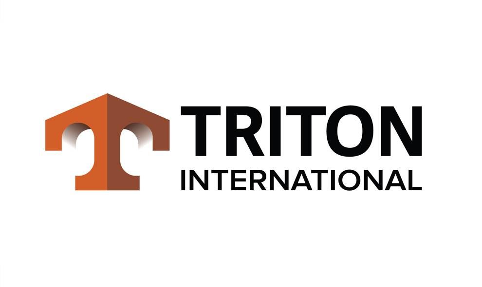
When two of the biggest shipping container companies merged, Triton was born as a Goliath of the seas. As such, it needed a logo that would showcase its grandeur within the industry and act as a mark of excellence anywhere in the world.
The illusion of the perspective created by the duo tones of orange reinforces solidifies the concept of security in a very literal way -- the logo becomes the object. It is paired with a modern sans serif font that allows this logo to remain recognizable and establishes the forward-thinking nature of the company.

The uppercase T might be the first thing viewers' notice, which gives the symbol a strong nautical influence -- it almost appears anchor-like, or like the tip of the ship.
This modified corner, which could also resemble the corner post that revolutionized the stacking properties of containers – evokes the spirit of the seas.
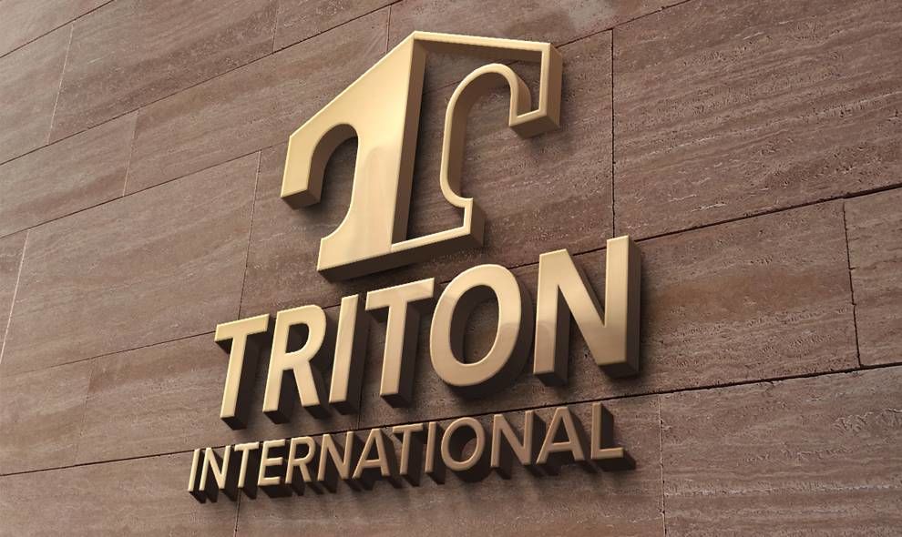
Triton International is a 3D logo design in the travel industry.


-preview.jpg)