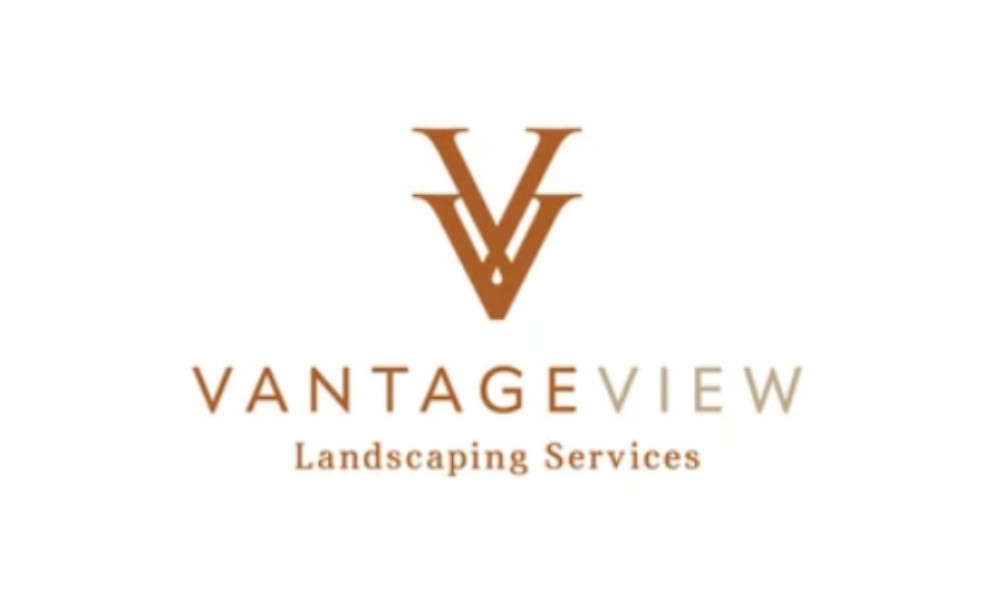
Standout Features:
- Earth-tone color schemes
- Double “V” design
- Stylish sans-serif typography
VantageView’s memorable logo design sets it apart from competitors in Lincoln, California with its rich terracotta, beige, and neutral sage earth-tone color palette. These colors radiate warmth, sophistication, and timeless charm that resonates deeply with the brand's values.
The logo’s double "V" mark, sometimes accompanied by hand-drawn florals, conveys balance, duality, and VantageView’s meticulous care in its landscape services.
Lastly, the designers from Krista Cavender Branding & Design carefully chose a stylish and sleek sans-serif typography. This choice encapsulates the brand's commitment to excellence, refinement, and elegance.
Get a chance to become the next Design Award winner.
SUBMIT YOUR DESIGN