- Leverage symbolic geometry to distill complex brand values into a simple yet powerful visual identity.
- Utilize symmetry and negative space to reinforce balance, strength, and brand memorability.
- Design with multi-surface adaptability in mind to extend logo relevance across diverse touchpoints.
Industry Insight:75% of consumers believe the “look and feel” of a logo can make or break a company’s chances of success, making Copa Design’s bold yet balanced approach essential to the strength of Vernon Davis’s expanding brand identity.
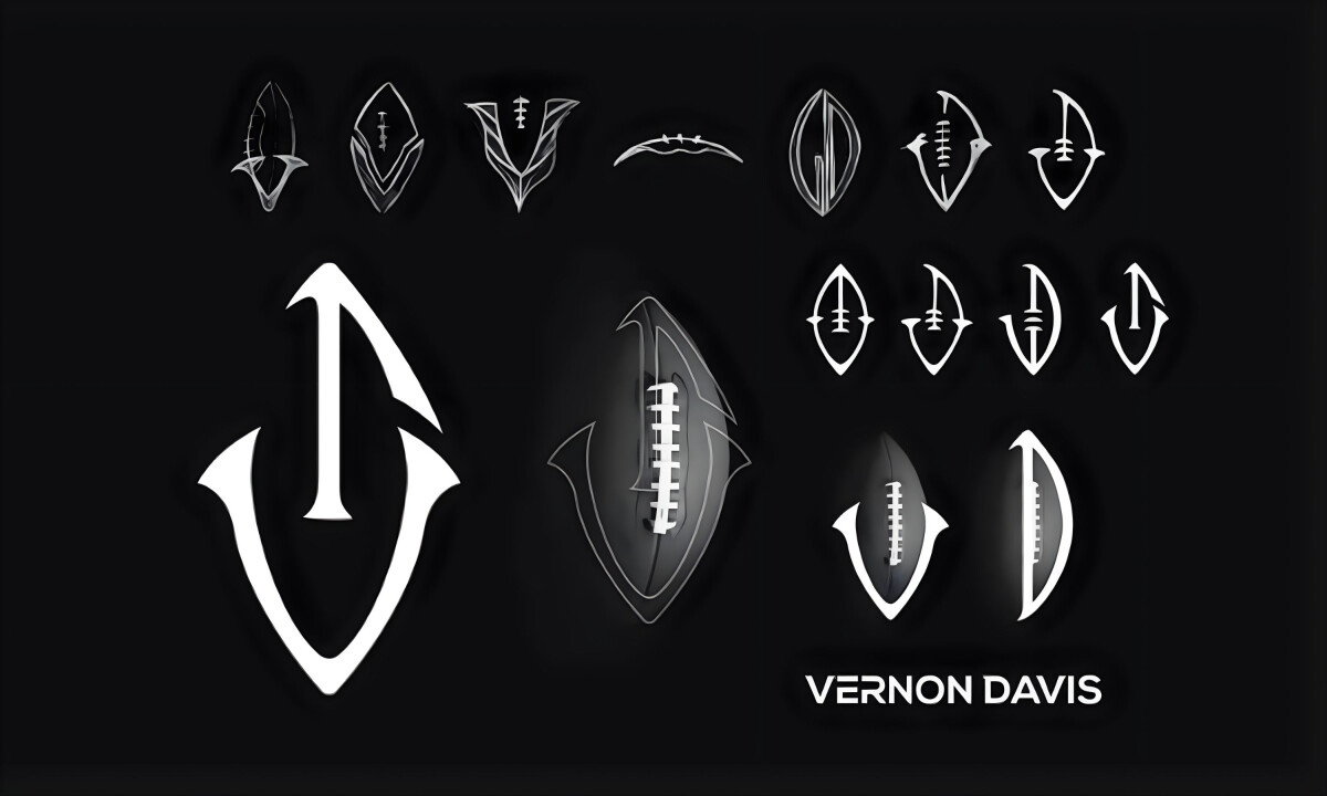
Football-Derived Monogram Construction
Copa Design built the logo around a tightly abstracted football silhouette that doubles as a stylized “V” and “D.” A strong vertical spine recalls the lacing of a football, while the outer curves narrow into sharp, blade-like points, all forming a single, unified shape rather than elements placed on top of one another.
This construction gives the mark a connection to football while keeping it flexible. It exemplifies the best logo design mechanics, feeling at home alongside Vernon Davis’s athletic history. It also carries enough restraint to work across corporate settings without losing purpose.
Symmetry and Duality in Form
Centered on a vertically mirrored structure, the logo balances sharp upward thrusts with grounded points to create a sense of order and control. Proportion and structure carry the idea of duality, reflecting Davis’s career without leaning on literal symbols.
“Symmetry, duality, and selective use of color with a logo that utilizes simplistic shapes to create meaning and brand identity that is recognizable and memorable.”
— Andrea Owsinek-Brucker, DesignRush Awards Jury
This structural clarity supports recognition at a deeper level. Research shows that logos with clear form and visual clarity improve recall and memorability, a principle consistently applied by top logo design agencies when building identities meant to scale across industries and platforms.
Through balance and compositional control, the mark avoids familiar sports clichés while remaining distinct.
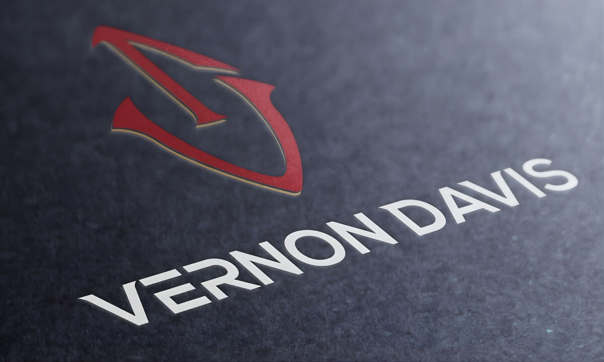
Restrained, High-Contrast Color Strategy
The color system stays restrained and high contrast, anchored by deep charcoal and matte black backgrounds with accents of bold crimson and muted gold.
Depending on placement, the mark shifts between flat white and metallic foil, allowing it to adapt while keeping a consistent visual tone.
This limited palette adds emotional weight without visual clutter. Crimson conveys drive and intensity, gold suggests earned success, and the absence of gradients keeps the mark crisp and controlled across apparel, digital use, and official merchandise.
Discover how color psychology helps define your brand through strategic color choices.
Material-Aware Adaptability
Copa Design clearly engineered the logo with physical production in mind. The enclosed geometry, thick-to-thin transitions, and clear silhouette allow for seamless reproduction via embossing, stitching, stamping, and digital printing. The logo retains its identity even on textured or curved surfaces.
This versatility is especially important for a personal brand like Vernon Davis’s, which spans everything from elite sports merchandise to lifestyle products.
Research shows that maintaining consistent brand assets across applications can contribute to 10–20% improvements in growth and revenue, reinforcing the logo’s role as a durable, future-proof asset across categories.
What Brands & Agencies Can Learn from Vernon Davis
Here are a few key lessons from this sports logo design, offering guidance for athletes, teams, and organizations building strong, adaptable visual identities:
1. Unify Symbolism and Identity Without Being Literal
Integrating initials into a meaningful silhouette creates a mark that resonates across contexts. This helps personal brands feel both iconic and flexible.
2. Use Finishes and Color to Convey Prestige
Metallic accents and bold hues can reinforce achievement and status. When applied thoughtfully, they elevate a monogram into a premium brand asset.
3. Design for Versatility Across Industries
Personal brands need emblems that work on apparel, websites, business decks, and corporate collateral. A flexible system future-proofs the identity as careers evolve.