





- Agency: Stanley Street
- Client: Wellington Educated
- Category: Logo Design — Education
- Location: Wellington, New Zealand
- Project Brief: Create an education logo design that helps Wellington Educated reconnect with local and international students through culture, community, and regional identity.
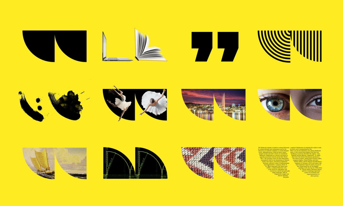
An education logo design carries its full weight when the mark works on multiple levels before the name is even read. Stanley Street's identity for Wellington Educated does that through two yellow semicircular forms whose edges cut into profiles reading simultaneously as open books, doorways, speech marks and Māori and Pasifika iconography.
The creativity lies in how much meaning fits inside a single mark. Open books, cultural welcome and an implied "W" for Wellington all occupy the same shape, while the Māori tagline "Hui Mai, Tui Mai" sits alongside the English name as a structural equal.
Electric yellow holds from a lapel pin to a flag to a full entrance installation without asking for a simplified version of itself. The mark switches between yellow-on-black, gold-on-navy and black-on-yellow with equal legibility at every size.
The mark is culturally specific enough to feel local and graphically clean enough to travel. A student encountering it on a blazer pin in Wellington and again on a recruitment poster abroad gets the same clarity, and the layered meaning gives it enough depth to reward a second look.