- Article by
- Branko Dimitrijević

#CA4408 #DCC3A4 #6A7B1E #6290AD
- Designer: Charlotte Lam
- Client: Winfield Venture
- Category: Logo Design — Professional Services
- Location: Toronto, Canada
- Project Brief: Develop a minimal, modern wordmark for an early-stage venture firm that communicates professionalism and technological confidence while remaining flexible for future brand expansion.
Professional services logo design needs to establish immediate trust without over-defining personality.
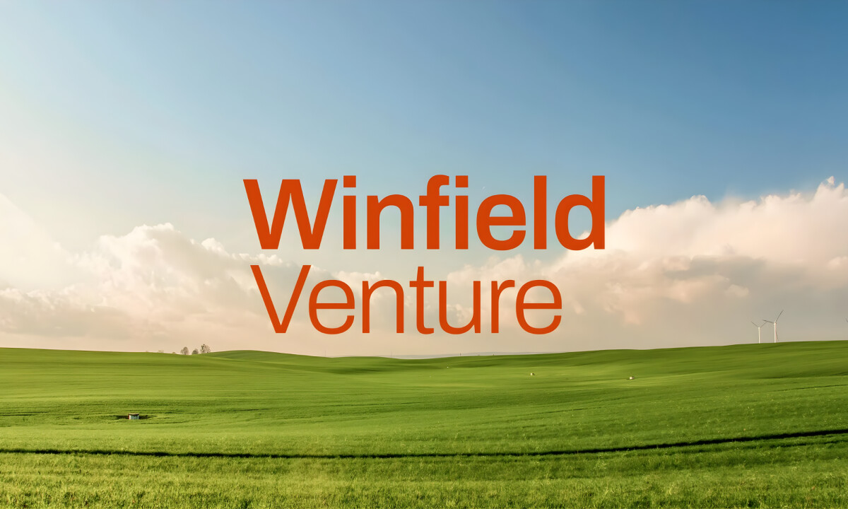
The Winfield Venture wordmark takes a restrained approach, focusing on proportion and clarity to create a foundation that can evolve alongside the company.
- Wordmark Structure & Typographic Restraint: The logo relies on clean letterforms and balanced spacing to project stability and seriousness. I like how the absence of stylistic excess keeps the mark neutral enough to support a wide range of future brand expressions.
- Color & Proof-of-Concept Applications: The warm orange and neutral palette used across mockups introduces energy without overpowering the typography. I believe this color system serves as a directional exploration, helping visualize how the wordmark can scale across digital and physical touchpoints.
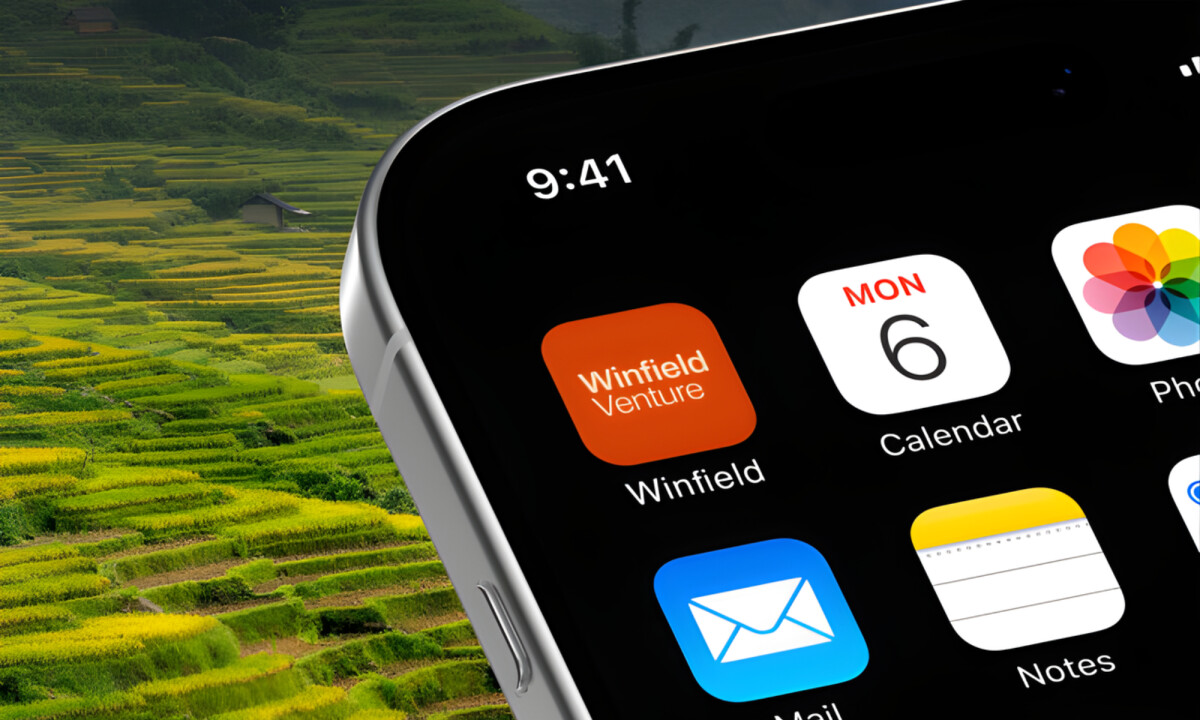
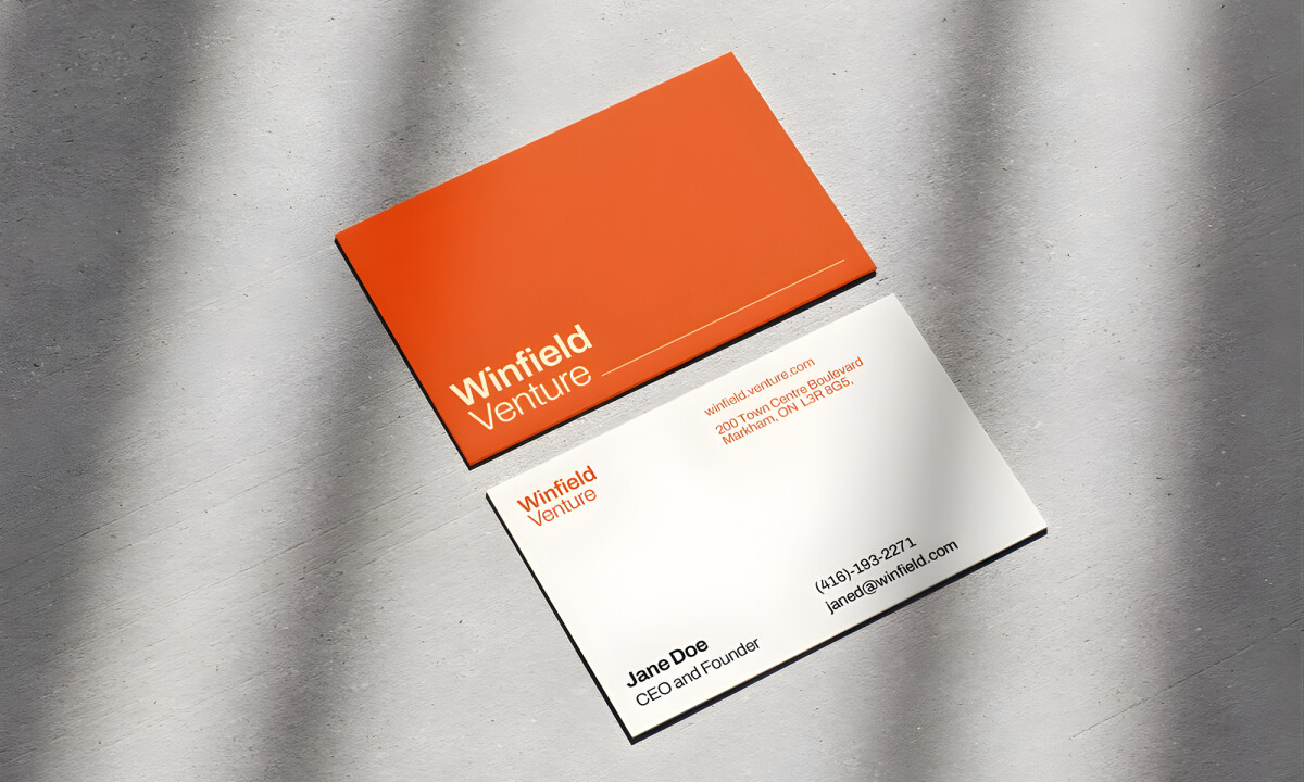
- Versatility Across Contexts: Applications on business cards, mobile icons, and signage demonstrate the wordmark’s adaptability. I appreciate that the logo holds its integrity at multiple sizes, which is essential for a venture brand that may expand across platforms quickly.
- Brand Positioning & Longevity: The overall system prioritizes longevity over temporary trend alignment. I think this restraint positions Winfield Venture as credible and forward-looking, allowing future identity layers to be added without needing to replace the core mark.
What Brands & Designers Can Learn from the Winfield Venture
1. Use Restraint to Build Trust Early
Clean letterforms and balanced spacing communicate stability and seriousness at first glance. For venture brands, neutrality can be a strength that signals reliability and confidence.
2. Treat Color as a Supporting Layer, Not the Identity
The warm orange palette adds energy without competing with the typography. Exploratory color systems help visualize future applications while keeping the core mark timeless.
3. Design for Scalability from Day One
Strong performance across business cards, mobile icons, and signage proves the value of simplicity. Logos that hold up at multiple sizes give growing companies flexibility as they expand across platforms.
Discord's Logo Is a Face. That's Not Cute. That's Strategic.
Redheads
Casa Macui