Standout Features:
- Stamp-like design
- Earthy color story
- Simple yet meaningful
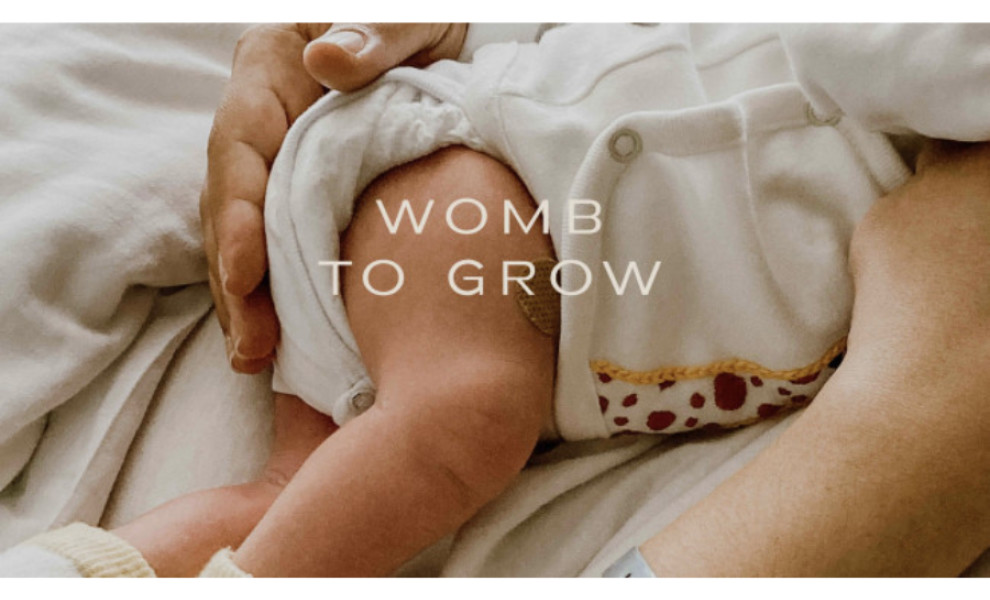
Maternity brands often highlight a woman’s femininity when creating logo designs, and this one is no exception. Womb to Grow's logo is one of the top-rated small business logo designs because of its simple yet touching message.
Browse our list of cool logo designs today.
Design agency Studio Evergreen used earth tones as primary colors, tying everything from Mother Earth being our first mother to the rawness of women in childbirth.
The design also looks like the stamps we often see from postal companies, implying that having a baby is heaven-sent and good news worthy of celebration!
Get a chance to become the next Design Award winner.
SUBMIT YOUR DESIGN