
Open your phone and look for the Zelle app. It is not there anymore. Early Warning shut the standalone app down on April 1, 2025. What is left is a logo built to be an app icon, with no home screen of its own to sit on.
Key Points:
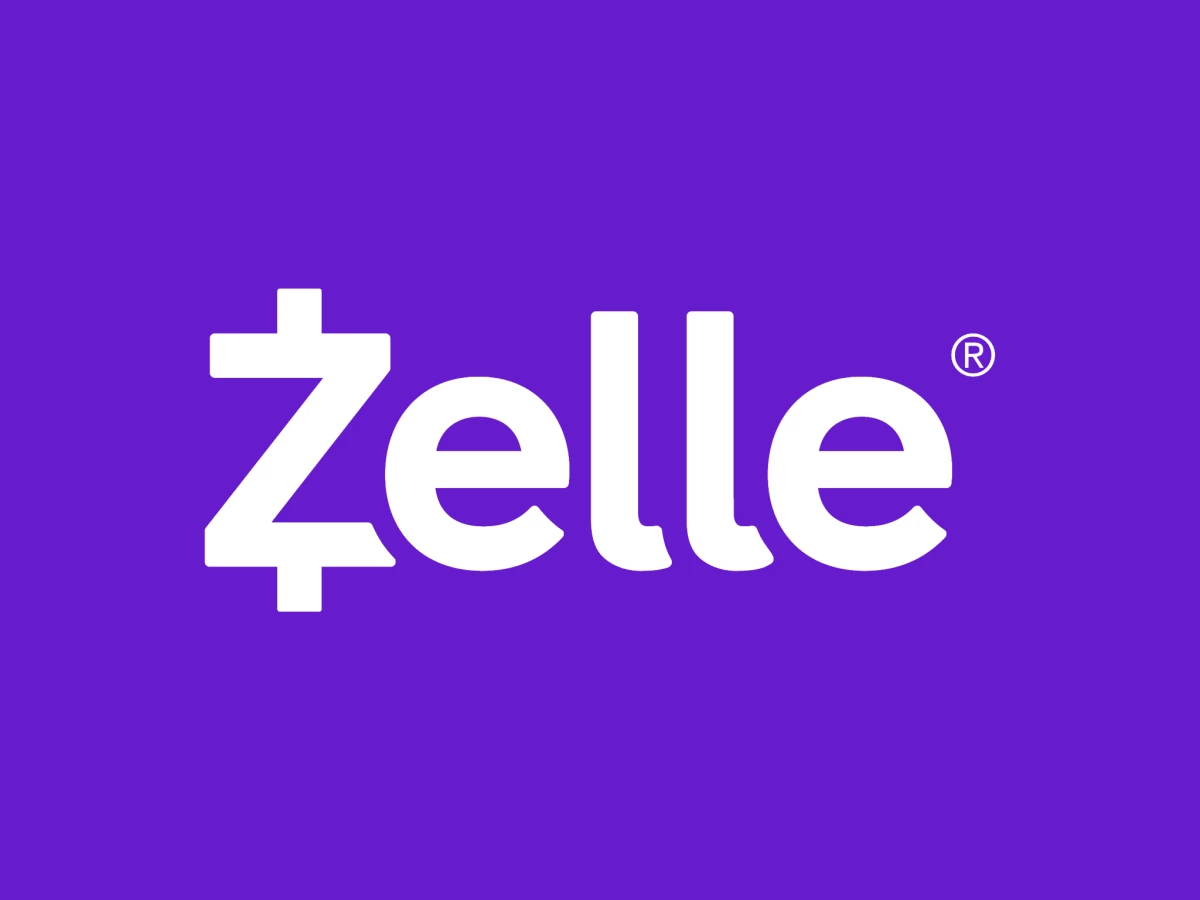
- The Zelle logo is a white wordmark on a purple field, and the capital Z carries short bars above and below that make it read like a currency symbol.
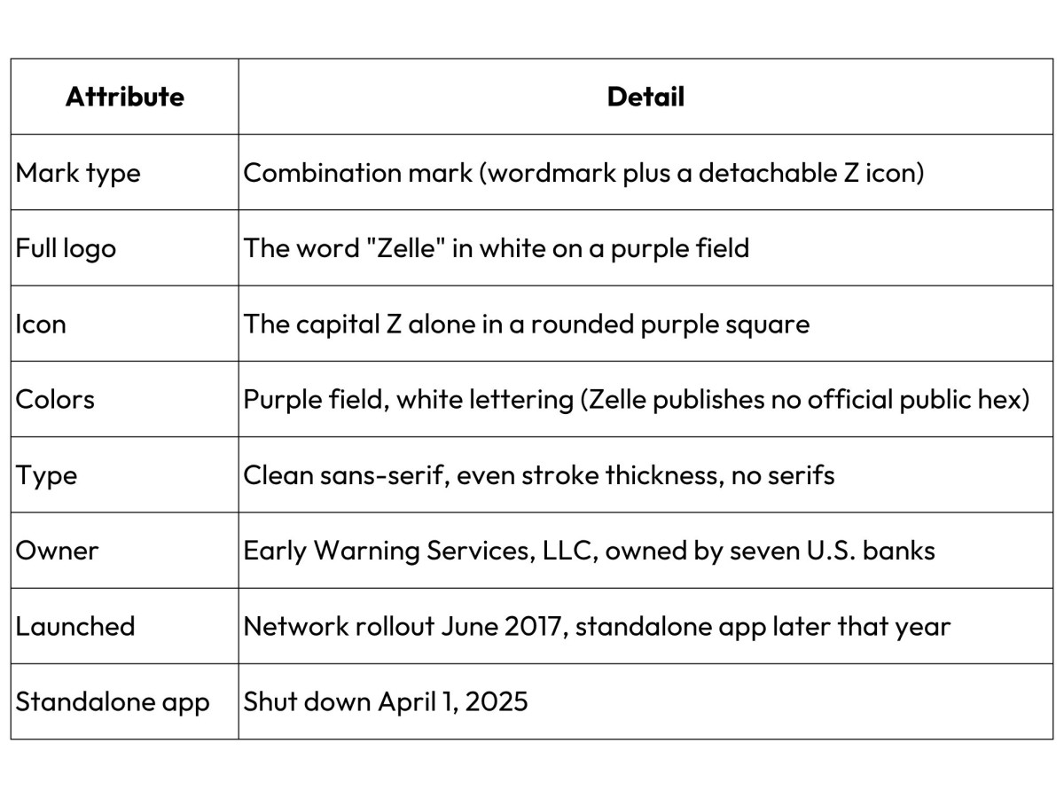
- Early Warning Services launched Zelle in 2017, and the core mark has held its shape since then.
- Designers built the Z to break away from the wordmark and sit inside a rounded purple square as an app icon.
- Early Warning shut down the standalone Zelle app on April 1, 2025, so the mark now rides inside partner bank apps instead of a home-screen tile.
- Early Warning claims the color purple itself as a Zelle trademark, which raises the stakes on a mark that no longer has its own app.What Is the Zelle Logo?
The Zelle logo is a combination mark. The full version sets the word Zelle in white on a purple field. The capital Z can also break away from the word and sit alone in a rounded purple square, which is how it worked as an app icon.
Here is the verdict up front. The mark is clever and easy to read. Its best idea was built for a home-screen tile, and that tile is gone, so the smartest part of the logo has lost its job. That makes Zelle a useful case study in how logo design can age out when the product around it changes.
Specs at a Glance
What Does the Z in the Zelle Logo Mean?
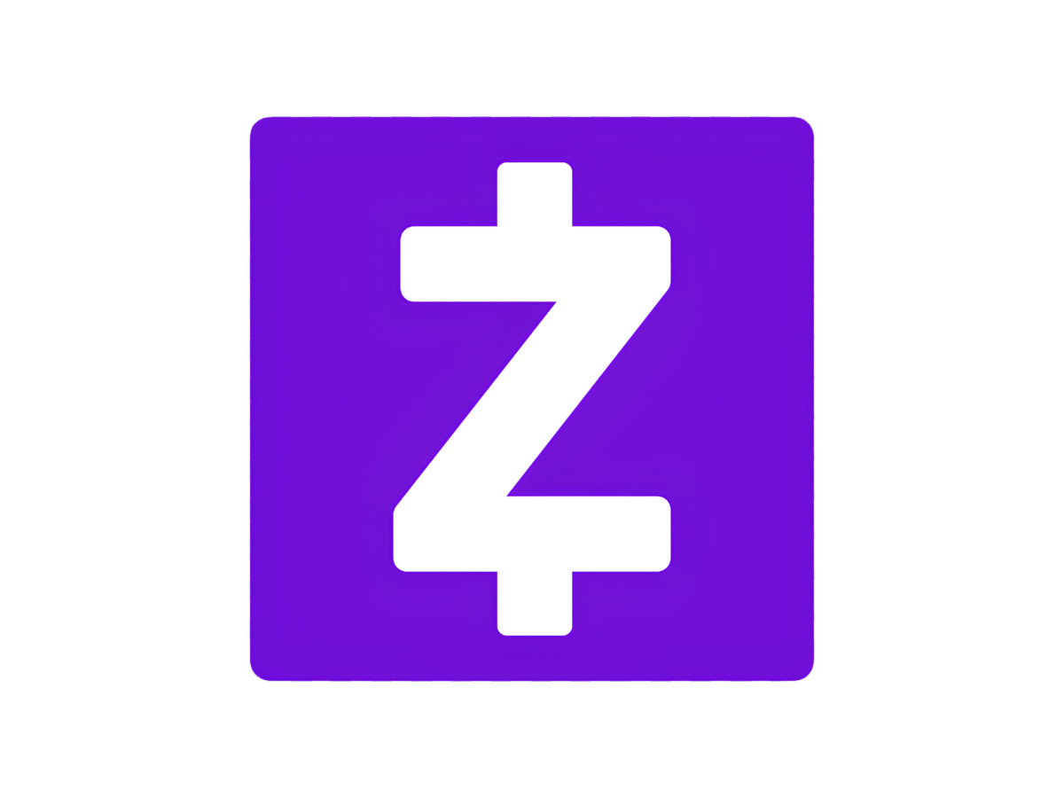
The Z is the whole design idea. It is a plain capital Z with two short bars added, one above the top stroke and one below the bottom stroke. Those two bars make the letter read like a currency symbol without actually being one.
The bars are short. Each one runs about a third of the height of the Z and sits on the letter's center line. Your eye lines them up the way it lines up the strokes in a dollar sign.
The trick depends on those bars, and the bars are the first thing to go when the icon shrinks. At around 24 pixels, a common size for a phone tile, the short strokes start to blur into the Z. The currency read weakens, and most people just see a letter.
The effect does survive in black and white, because the bars are shapes rather than a color trick. Shrinking the icon is the real threat to it.
Some readers flip the whole thing in their head and see a dollar sign turned 180 degrees. That tells you how the mark reads, not what the designers meant. Zelle has never explained the Z in public.
Why Is Zelle Purple?
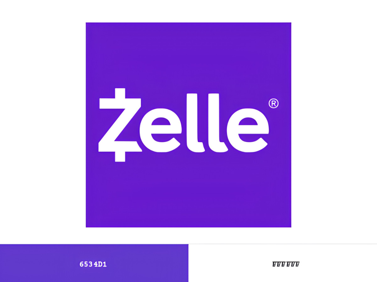
Purple is a strange color for a U.S. bank, and that is the point. American banking leans on blue and red. Chase runs blue, and Wells Fargo runs red and yellow. A purple money brand stands apart on a screen full of them.
Here is my read, and no primary source confirms it. Zelle is owned by seven banks that compete with each other. A brand owned by rivals cannot safely wear any one owner's color. Purple steps around that problem, because none of the owners built their identity on it.
One caution on that theory. Truist, one of the seven owners, adopted purple in 2019. That came two years after Zelle launched, so Zelle did not dodge a color a member already used. At launch the seventh owner was BB&T, which later became Truist.
Whatever the first reason was, Zelle now treats purple as property. Its own trademark guidelines claim the color purple itself as a Zelle trademark, right alongside the name. Owning a color is a serious brand move, the kind United Parcel Service made with brown.
Who Designed the Zelle Logo?
No one holds an official public credit for the Zelle logo. Zelle and Early Warning have never named a designer. The trail points to Huge, a New York design agency, but it points through the designers, not through Zelle.
Two people who worked on the brand name Huge in their own portfolios. Art director Radu Becus lists Zelle branding under Huge. Designer Abe McCallum lists building the Zelle brand and app at the agency. Huge is a branding agency based in New York.
That is real evidence, but it is self-reported. Zelle has not confirmed it, and no primary company document names Huge. So the honest answer is a strong maybe. Huge is the best-supported name, and the company behind the brand has stayed quiet.
How Did Zelle's Identity Get Here?
Zelle grew out of an older bank network called clearXchange. Three big banks, Bank of America, Wells Fargo, and JPMorgan Chase, started clearXchange in 2011.
Early Warning Services bought clearXchange in 2016. The next year it relaunched the network under the Zelle name. The rollout to partner banks began in June 2017, and the standalone app followed later that year.
The old clearXchange mark was blue. The switch to purple came with the Zelle name. The core purple mark has held its shape since then, with only small tweaks.
What Happens to an App Icon With No App?

An app icon with no app becomes a badge. Early Warning shut down the standalone Zelle app on April 1, 2025, after saying that only about 2 percent of Zelle payments still ran through it. The purple Z that was built to own a home screen now lives inside other companies' apps.
That matters, because the detachable Z was the whole trick. The design assumed a tile on your phone, tapped the way you tap Venmo or Cash App. Take away the tile and you take away the stage the icon was drawn for.
Venmo and Cash App still own their tiles. Cash App puts a white dollar sign on a green square, and you tap it to open the app. Venmo uses a light-blue V the same way. Both marks still work as doors you walk through.
The Zelle Z does not get that anymore. Inside a Chase or Wells Fargo app, it shows up as a small purple button next to a list of other features. It reads as a label on someone else's shelf. The same trap shows up across app design whenever a brand rents space inside a platform it does not control.
The app itself hung on as a statements-only shell into August 2025. After that, the tile the whole logo was built around was simply gone.
Verdict
The Zelle logo is a good mark that outlived its own plan. The Z-to-icon idea was the smart part, and it worked right up until the app went away. Now the cleverest move in the design has nowhere to happen.
The purple still carries the brand, and the wordmark still reads clean. The problem is the icon. Designers drew it to anchor a home screen, and now it is a guest inside other people's apps.
Zelle designed a logo to own a door. Then it gave away the house.

Our team ranks agencies worldwide to help you find a qualified partner. Visit our Agency Directory for the Top Logo Design Companies as well as: