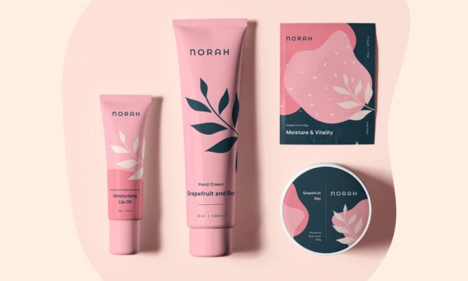
Team Behind the Design
Packaging Design Analysis

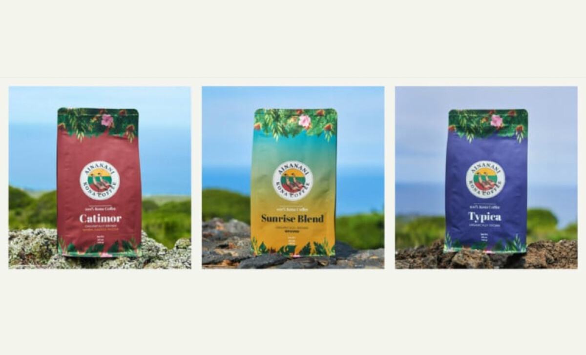
Strong coffee packaging often comes alive through place-based storytelling, and Ainanani Kona Coffee leans into that strength beautifully.
- Structure: I like how the illustrated canopy frames each bag from top to bottom. It guides the eye toward the emblem and blend information while surrounding everything with the textures of Hawaii’s flora.
- Emblem & Wildlife Illustration: The central badge featuring birds creates a strong storytelling centerpiece. I appreciate how this emblem elevates trust and gives the brand a sense of heritage that resonates with premium coffee audiences.
- Typography & Blend Hierarchy: The serif blend naming is confident, legible, and balanced against the vibrant illustrations. This mix of craftsmanship and clarity helps the packaging feel both artisanal and credible.
- Shelf Impact: The volcano-to-sea gradients give each variant strong visibility. Their saturated tones can catch attention fast, helping the brand compete confidently on crowded coffee shelves.
What Brands & Agencies Can Learn from Ainanani Kona Coffee
Coffee packaging often competes on origin and storytelling, and this project shows how illustration, color, and emblematic structure can bring those elements to life.
1. Use Illustration to Anchor Origin Stories
Region-specific flora, wildlife, or cultural elements can communicate authenticity faster than text ever could. When applied consistently, these illustrated cues become a powerful part of the brand’s identity.
2. Apply Color to Create Emotional Differentiation
Gradients tied to natural environments can convey warmth, freshness, or intensity while distinguishing product variants. This helps customers navigate blends at a glance, even in crowded retail spaces.
3. Balance Art with Structure
Rich illustrations work best when paired with clear typography and strong layout anchors. This balance keeps the packaging premium and readable while giving room for artistic storytelling to shine.
About DesignRush Featured Designs
At DesignRush, we review hundreds of agency projects each month. The featured designs stand out for creativity, relevance, and execution.
Many go on to be recognized as winners of our Monthly Design Awards.
Explore more creative work here:
- Best Packaging Designs
- Best Website Designs
- Best App Designs
- Best Logo Designs
- Best Print Designs
- Best Video Designs
For a full list of design agencies and related services, see our Agency Directory.