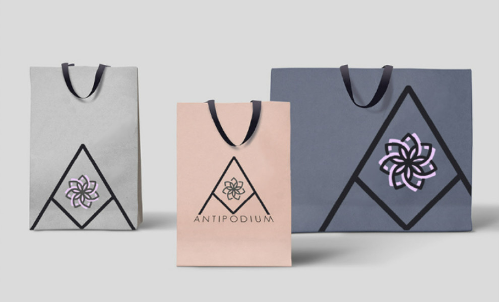
Standout Features:
- Stylized flower emblem
- Pink as a primary color
- Geometric-style letter “A”
Chloe Lloyd's logo design for Antipodium combines a flower emblem, gentle colors, and sharp objects and fonts, creating a feminine and edgy look. At the heart of the logo is a stylized flower symbol, which imparts a gentle and feminine feel to the design. This emblem is central to the brand's identity, symbolizing beauty and style.
The designer chose pink as the primary color of this design to reflect the brand's female-oriented audience and popularity in the fashion industry. This color is accented by gray, helping it stand out.
Around the pink and gray colored flower, the geometric-style letter “A” is strategically placed to add a layer of structure and sharpness to the design. The geo sans font enhances the logo design's edginess, ensuring readability and maintaining its stylish look.