Standout Features:
- Pastel color scheme
- Posh-looking packaging
- Nautical-inspired accents
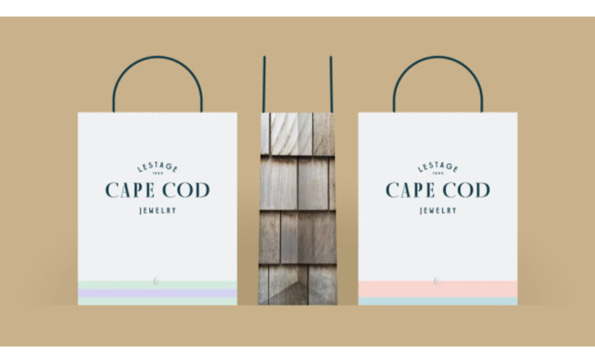
The Cape Cod Jewelry Collection's jewelry packaging, rebranded and designed by Nelson Couto, emphasizes quality, design, and craftsmanship. As part of the rebranding, the packaging aimed to give the collection a unique voice, separating itself from counterfeits.
The pastel color scheme resonates with the brand's New England heritage, contrasting with the deep blue-green hues of the box. The nautical-inspired accents, such as the compass border, are a charming addition to the packaging design. It gives off a simple, sophisticated look, ensuring the collection stands out. Explore the best jewelry website designs here.
Get a chance to become the next Design Award winner.
SUBMIT YOUR DESIGN