Standout Features:
- Mix of bold and thin typefaces
- Earthy colors
- Simple yet premium
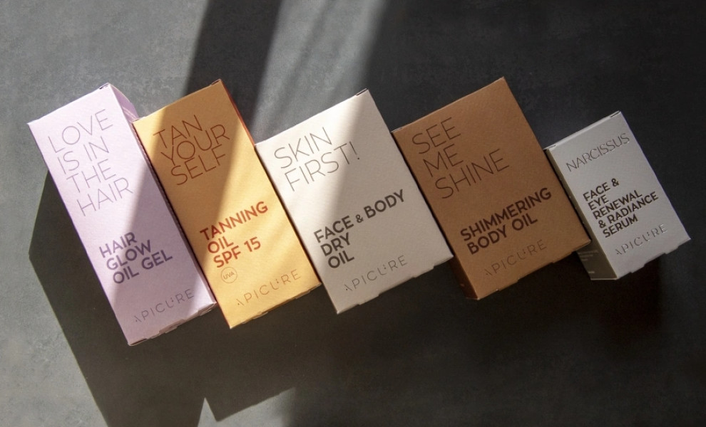
Crossbow has meticulously designed the packaging for Greek brand Apicure, reflecting its natural ingredients and the summer spirit of their new cosmetics series.
The mix of bold and thin typefaces in the packaging design adds a dynamic visual contrast, enhancing readability and aesthetic appeal. The solid earth colors and distinctive typography create a casual yet premium identity for the collection.
Get a chance to become the next Design Award winner.
SUBMIT YOUR DESIGN