Team Behind the Design
Packaging Design Analysis
I love when packaging finds the perfect balance between simplicity and sophistication, and Glaze achieves exactly that.
The look is clean, modern, and feminine without feeling overly polished. It instantly communicates “premium haircare,” yet stays approachable enough for everyday use.
- Concept: I can tell the design’s strength lies in its restraint. The muted blush tones paired with sharp typography create a calm, confident aesthetic that speaks to a professional yet accessible brand.
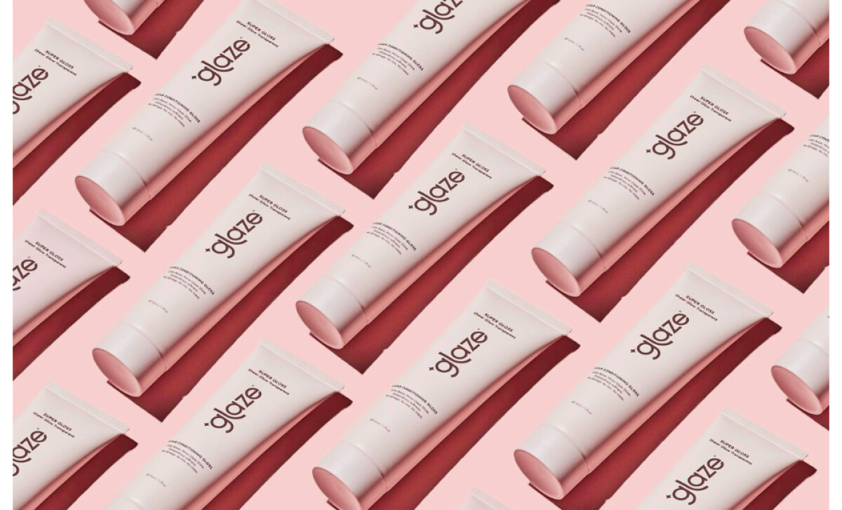
- Typography: The stacked and rotated “glaze” wordmark is bold but elegant. It draws attention while keeping a sense of vertical balance that looks beautiful on bottles and tubes alike.
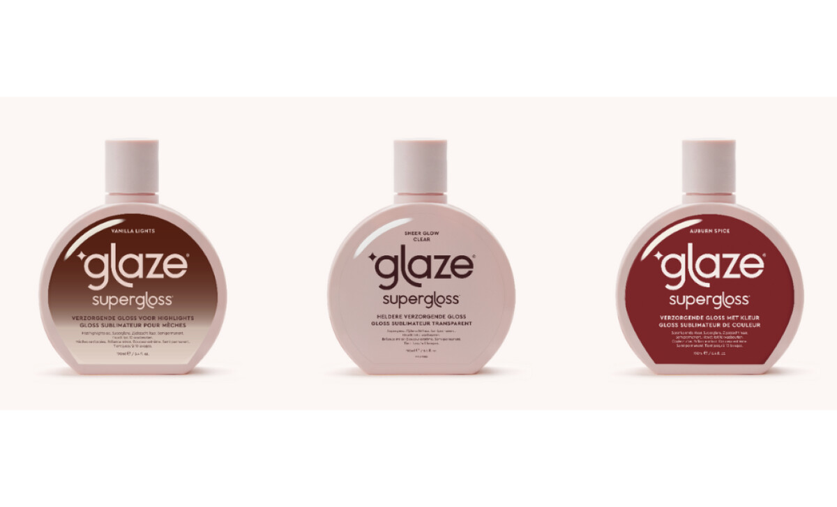
- Color Palette: The use of soft pinks, nudes, and metallic finishes gives the line warmth and modernity. Each variant has its own hue, helping shoppers quickly identify products without losing cohesion.
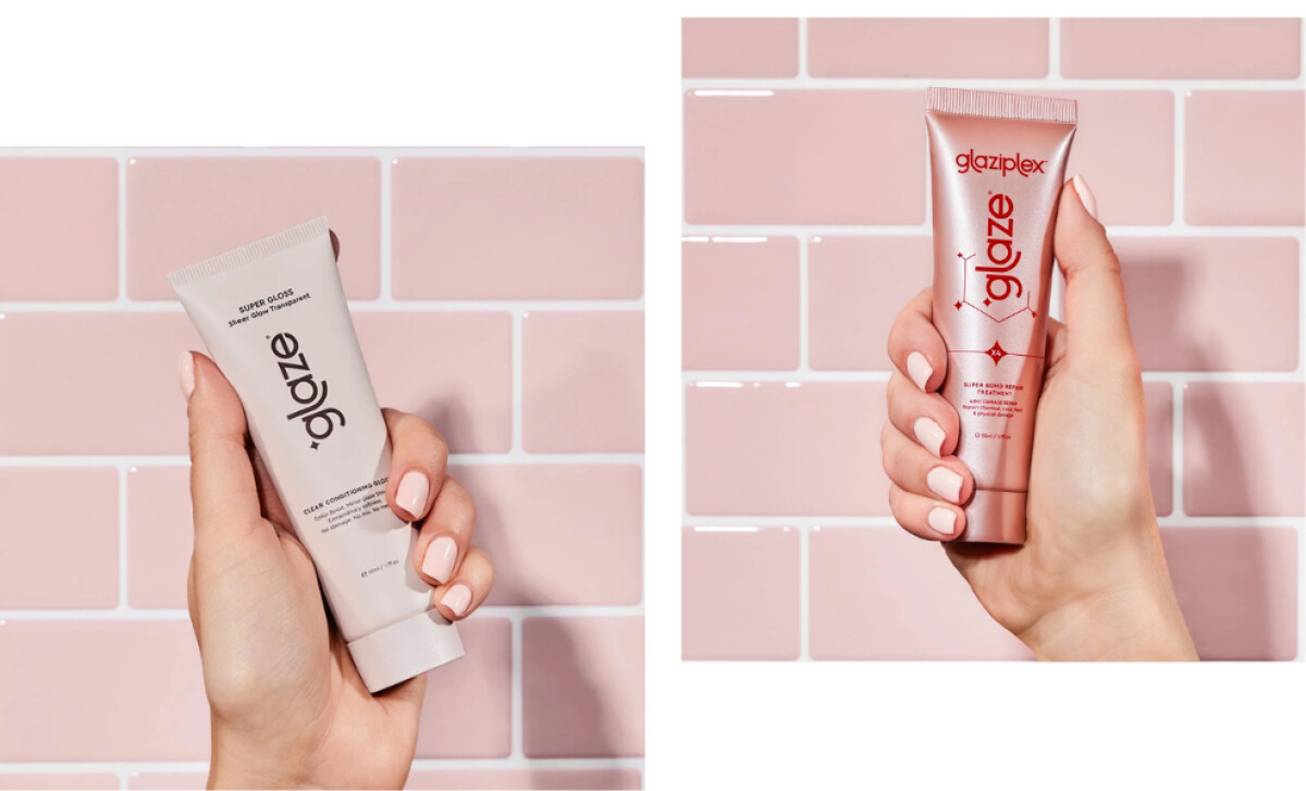
- Adaptability: I admire how well the design transitions across products and markets. The same minimalist layout adapts perfectly for the mini versions and translated labels, showing strong consistency in brand voice.
What Brands & Agencies Can Learn from Glaze
Poppy Calypso’s work for Glaze shows how beauty packaging can communicate confidence without excess. It’s a study in how clarity and consistency build trust across products and markets.
1. Keep the Message Simple
The packaging doesn’t rely on heavy graphics or embellishment. Its strength comes from precision and calm. This shows that clarity can feel just as luxurious as complexity when every detail is deliberate.
2. Let Color Speak Softly
Each tone in the Glaze palette feels chosen, not decorative. The pinks and metallics bring warmth and modernity while maintaining a unified voice. Color becomes part of the storytelling rather than an afterthought.
3. Design for Real-World Flexibility
The packaging adapts seamlessly between sizes, languages, and product lines. That kind of foresight makes a brand scalable and recognizable, no matter where it appears.
About DesignRush Featured Designs
At DesignRush, we review hundreds of agency projects each month. The featured designs stand out for creativity, relevance, and execution.
Many go on to be recognized as winners of our Monthly Design Awards.
Explore more creative work here:
- Best Packaging Designs
- Best Website Designs
- Best App Designs
- Best Logo Designs
- Best Print Designs
- Best Video Designs
For a full list of design agencies and related services, see our Agency Directory.


