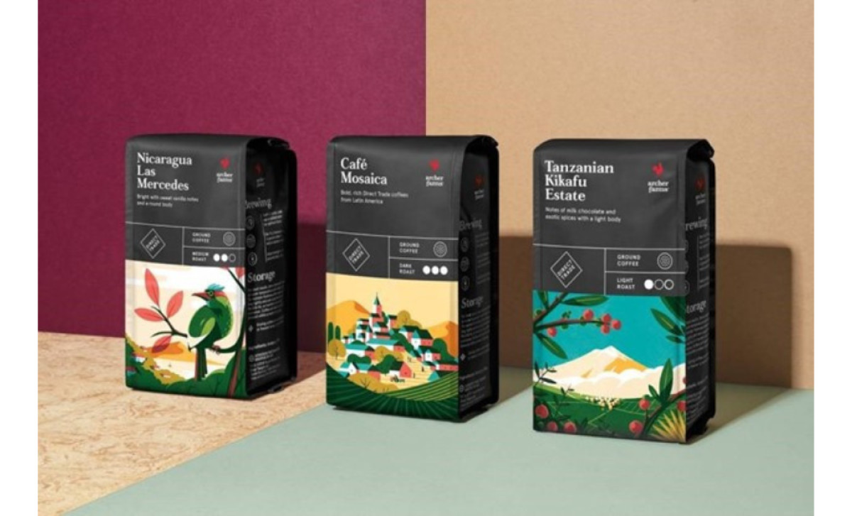
Standout Features:
- High-contrast, hand-drawn illustrations
- Modern typography and intuitive icons
- Structured, informative side panel
Archer Farms Coffee packaging design, crafted by COLLINS, stuns with beautiful artwork colored with vivid hues of bold colors and a small but impactful logo. The red rooster is a great choice for Archer Farms because it simply promises you’ll rise and shine – after your first cup of caffeinated deliciousness, of course.
Even though the pictures dominate half of the packaging’s face, they aren’t obtrusive. The difference between the upper half is well – balanced with lines and icons. Each blend has its own hand-drawn illustration but when placed on a shelf next to each other, it’s almost as if they together paint a large mural, connecting into a seamless artwork.
Icons are prominent and easy to comprehend, displaying information about the blend, the roast’s strength, origin, taste and type. On the side, the textual content dominates the space for those who want to learn more about storage and the best way to brew your coffee in just the right way.
It also shows that the brand cares about how you will use their product, and they want you to enjoy that experience, not just prosper on the sales.


