Standout Features:
- Playful, warm branding
- Bold color scheme
- Unique, consistent design elements
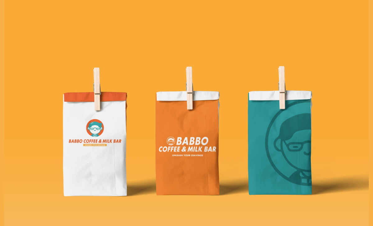
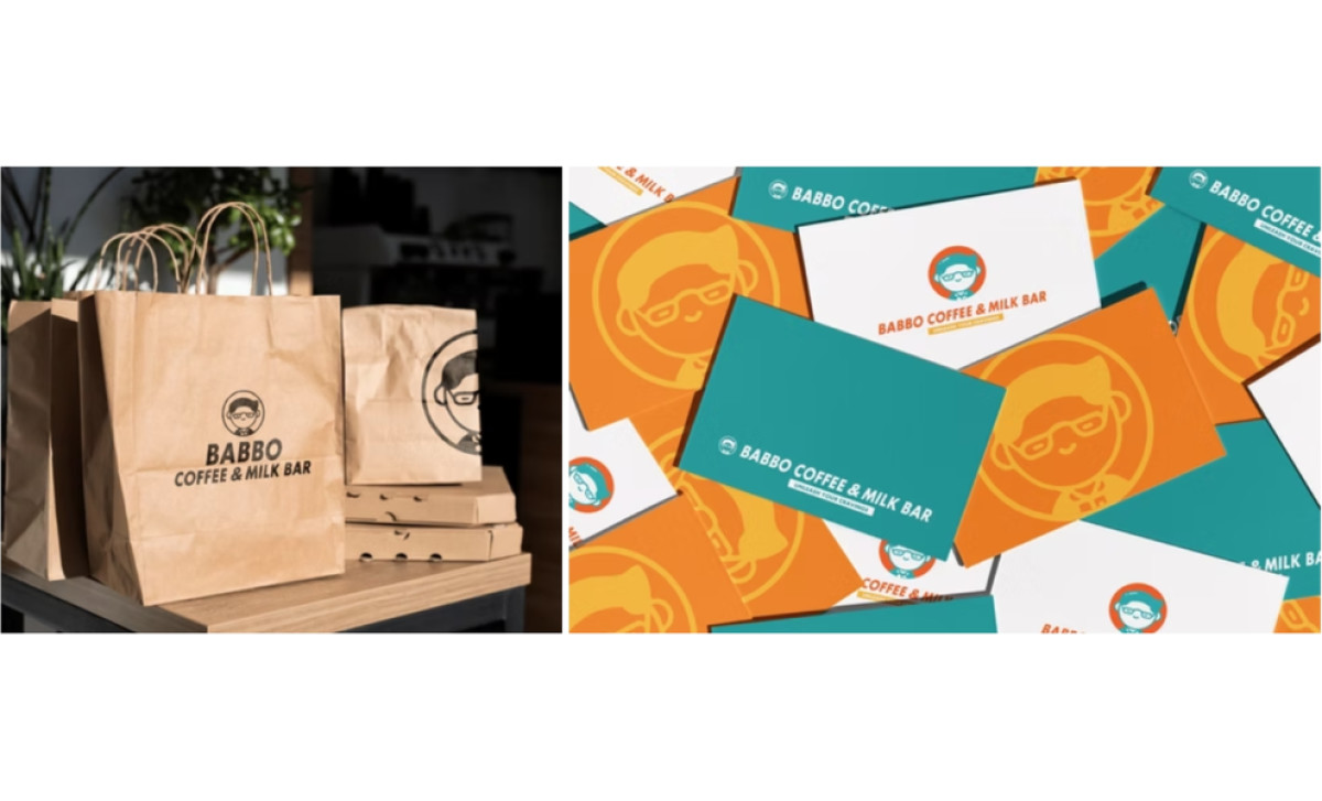
Babbo Coffee & Milk Bar, located in Manila’s U-Belt area, offers high-quality coffee and milk drinks, with packaging designed by Gobrandia Designs that perfectly reflects its cozy yet sophisticated vibe. Drawing inspiration from the owner’s love for their father, it creates a comfortable and approachable feel, making it stand out in the competitive café market.
What sets the packaging apart is its playful branding. The inclusion of the logo, featuring a simple, friendly character with glasses, reflects the personal connection between the brand and the owner’s family. This minimalist logo evokes warmth, making customers feel at ease.
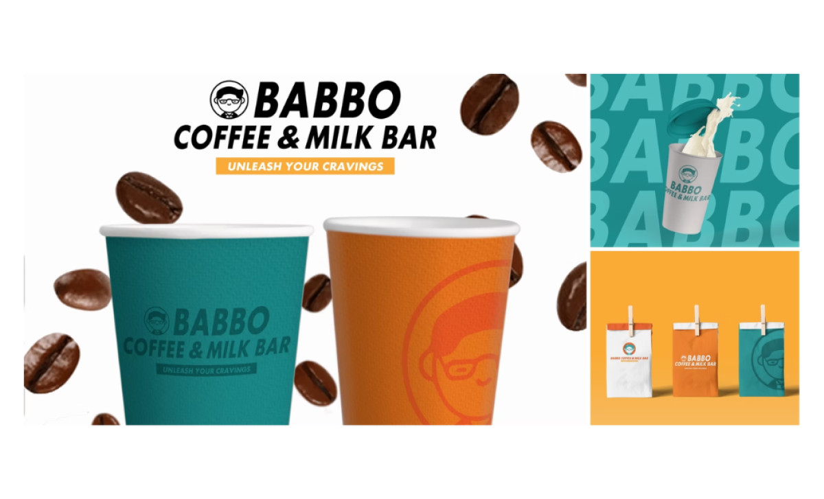
The bold color scheme of vibrant oranges and teals makes the packaging striking and energetic. These colors embody the fun and casual vibe of the café while standing out on the shelves. The consistent use of bright hues across all packaging elements ensures a unified brand presence and enhances visibility in a busy market.
Additionally, the clean typography and rounded shapes complement the friendly, approachable tone. Using the smiling, glasses-wearing character on all items reinforces the brand’s personal connection, creating a reliable and consistent experience for customers from the coffee cup to business cards.
Overall, Babbo Coffee & Milk Bar’s food and beverage packaging successfully blends playful branding, bold color choices, and consistent design elements to create a strong, welcoming identity. Through its blend of fun and warmth, the packaging effectively invites customers to experience Babbo’s unique charm.