Standout Features:
- Inclusive, edge lion-human illustrations
- Vivid, flavor-matching color palette
- Message-fitting blurb patterns
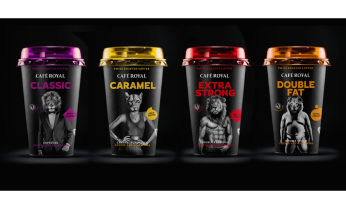
Café Royal’s packaging design embraces a regal spirit with a modern twist. The inclusive, edge lion-human illustrations feature male and female bodies crowned with lion and lioness heads, each tailored to its flavor — think a lion in a tux for the Classic blend, a ripped figure for Extra Strong, a plump form for Double Fat, and an elegant lioness for Caramel Toffee.
A vivid color palette reinforces each flavor’s identity, with royal purple setting the stage for Classic and bold red highlighting Extra Strong. Complementing these visuals, the message-fitting blurb patterns echo the character of each roast: tastefully aggressive for Extra Strong, soft and elongated for Caramel Toffee, prim and square for Classic, and plump and round for Double Fat.
Together, these design elements celebrate diversity and flavor and invite customers to “Feel good in your body. Drink Café Royal and roar.”