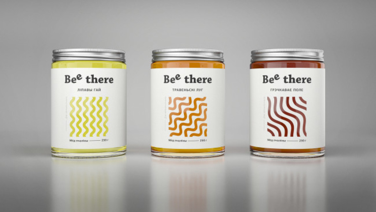
Standout features:
- Quirky typography
- Clean, white background
- Line patterns symbolizing types of honey
Bee There is a honey producer that wanted to celebrate the leading actor in their products’ production – the bees. So, AIDA Pioneer tried to emulate the gratefulness of the bees by integrating their “culture” into the packaging design.
We see a clean, white-label surrounding the jar. On it, there’s a simple brand representation with quirky typography focused on the second “E” in “BEE,” tilting it diagonally. Below it is a cut-out lined pattern.
At first glance, this is a minimalistic design with limited features. However, like all great designs, it has a story behind it. The geometric design of each label depicts the bees’ way from the hive to different places of the honey flow. The patterns and the dispositioned “E” refer to the bees’ means of communication: the waggle dance. So effectively, this packaging design conveys the bees’ language to the jar with an extraordinary visual device.


-preview.jpg)

-preview.jpg)
