Standout Features:
- Culturally-inspired color and pattern integration
- Minimalist white framing with a vertical product window
- Unified label architecture
Kirsten Graphic Design undertook the packaging for Belgian Chocolate Creations, a specialist in private label luxury chocolates with diverse flavor profiles. The design system aims to position the brand at the high end of the market. It does so by infusing products with regional character, a luxurious feel, and strong visual appeal on shelves.
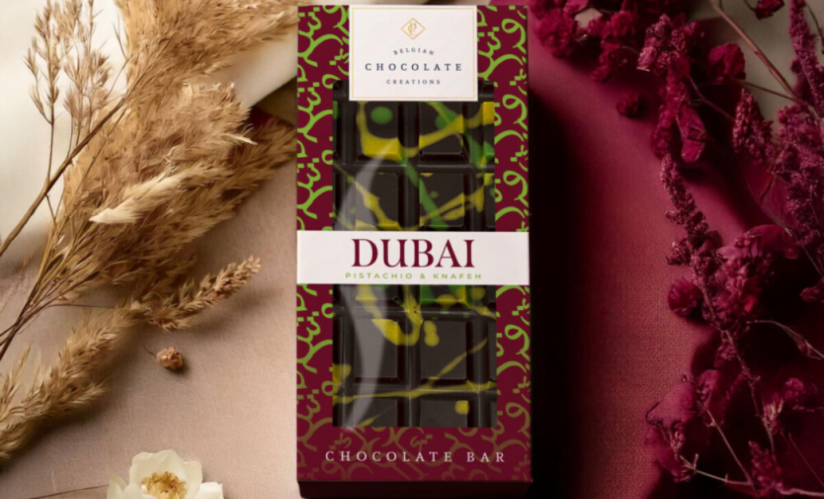
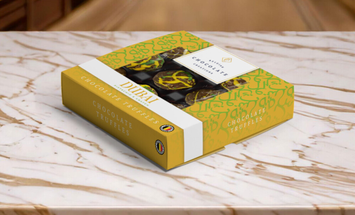
A standout is the "Dubai" series packaging. Each uniquely colored bar has its own similarly colored box — complete with Arabic lettering patterns that evoke regional aesthetics. Both feature a prominent white band with "DUBAI" in elegant serif. This design communicates the exotic flavor origin and appeals to those seeking premium, culturally distinct offerings.
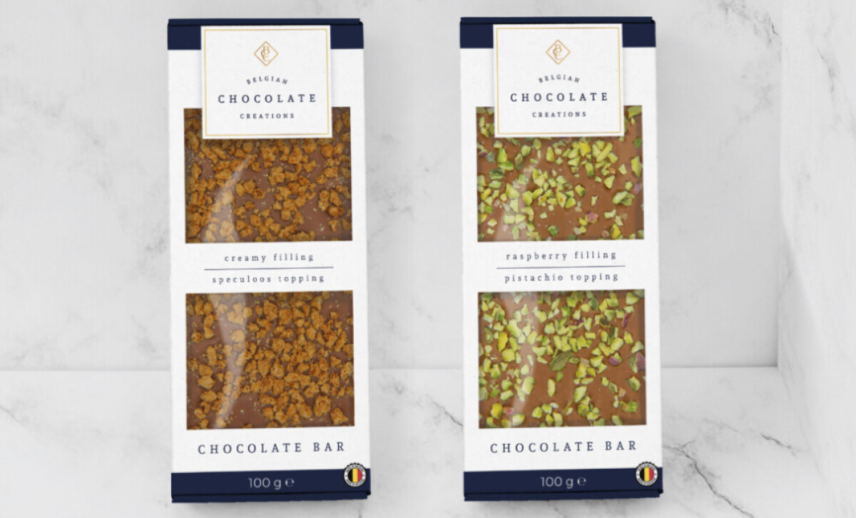
The non-regional chocolate bars feature a clean white background with a vertical double-window, offering a glimpse of the toppings. This is a key feature, as research indicates 73% of shoppers rely on packaging elements like product visibility to make buying decisions. This minimalist approach allows the product's visual appeal to take center stage, fostering trust through transparency.
The food packaging design utilizes a smart, unified label architecture. Regardless of the specific product line, the name appears in a white horizontal band against the product’s window panel. This provides an intelligent balance between customized product storytelling and overall brand consistency.
Belgian Chocolate Creations demonstrates how a system can balance cultural richness with minimalist elegance. This approach allows a private label brand to cater to diverse market tastes while maintaining a cohesive, premium identity, enhancing the perceived value and sensorial promise of the confections.

-preview.jpg)


