Standout Features:
- A stark, minimal label design
- Typography as identity
- A confident rejection of marketing fluff
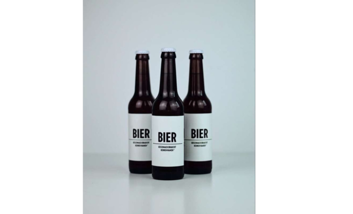
Bier Bier is proof that in a world drowning in choice, simplicity can win big. The German brand’s philosophy, "No Name. Just Taste." is a rare moment of honesty in an industry obsessed with storytelling, elaborate back labels, and increasingly convoluted craft beer names.
There are no illustrations of rolling barley fields, no poetic tasting notes, no gimmicky copywriting. Just a bottle, a label, and the word bier in bold sans-serif. It’s refreshingly self-assured, a beer that doesn’t feel the need to impress you before you even take a sip.
The word bier isn’t just the name — it’s the logo, the message, and the entire brand identity rolled into one. The choice of a strong, geometric sans-serif typeface reinforces the brand’s no-nonsense approach. It’s typography used at its most powerful: not as an accessory to design, but as the design itself.
It’s no surprise Bier Bier earned a Special Mention at the 2017 German Design Awards in the Packaging category. It’s a lesson in branding through absence — letting the product do the talking rather than relying on trendy packaging.
Stripping branding down to its bare essentials is a bold move in craft beer packaging, where the prevailing wisdom suggests that consumers need to be wooed with intricate artwork or quirky typography.
Bier Bier throws all of that out the window and delivers an aesthetic that’s almost absurd in its simplicity — so much so that it loops back around to being genius. A plain white label on a brown bottle, black type, no embellishments. It’s the anti-brand, and in a crowded market, it stands out by refusing to play the game.
-preview.jpg)


-preview.jpg)