Ringana is uncompromising when it comes to the quality of ingredients that go into their supplements. They place an emphasis on natural ingredients with no additives. The designers who developed Ringana’s rebranding had to ensure that the packaging design matched the philosophy that the company enforces in every product.
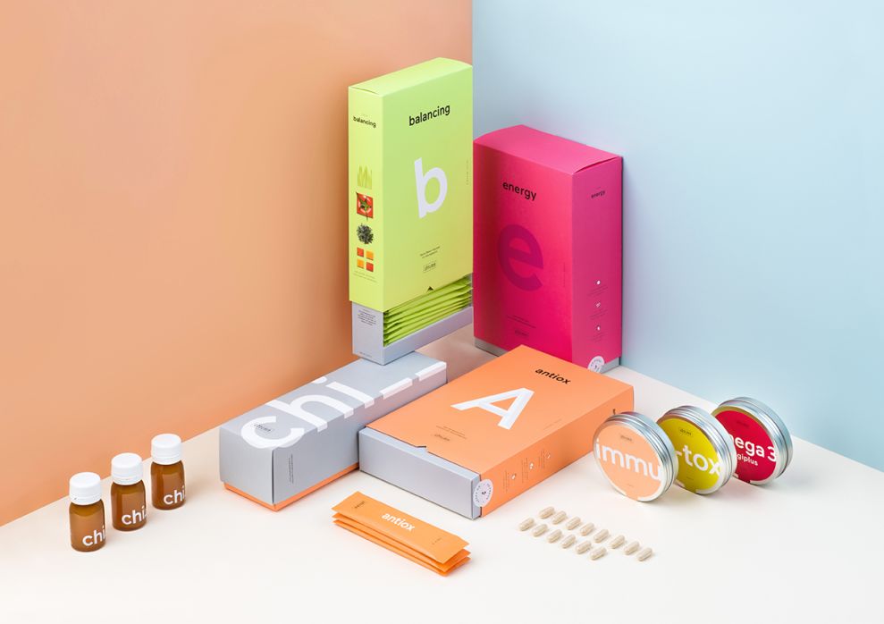
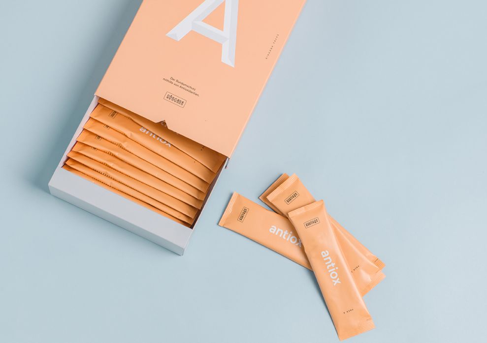
Simple is key for both the packaging design and the actual product—no added ingredients and no unnecessary design elements. The result is a very clean packaging that consists of one color to represent each variety. Without even knowing anything about the brand, you immediately feel like they value simplicity.

The typography on the packaging keeps with the simple, clean design. A straightforward, black font displays the specific version of the product, but the real focal point is a large letter with a style and color that morphs well with the rest of the packaging. The only images are small, simple photos of the actual ingredients in the supplements. Again, this puts an emphasis on simplicity. How many supplements can show all of their ingredients in photos on the side of the box?

Bright colors and an emphasis on simplicity and clean packaging: That’s Ringana. It’s not easy for a brand to tell their story just through their packaging. Ringana accomplishes exactly that. With one look, consumers may not learn everything there is to know about Ringana, but they will definitely understand that the company cares about natural ingredients and health without sacrificing flavor.
Ringana - Superfoods is a colorful packaging design in the Food & Beverage industry.

-preview.jpg)

-preview.jpg)