Standout Features:
- A seal of assurance
- A typographic blend
- Intriguing foliage pattern
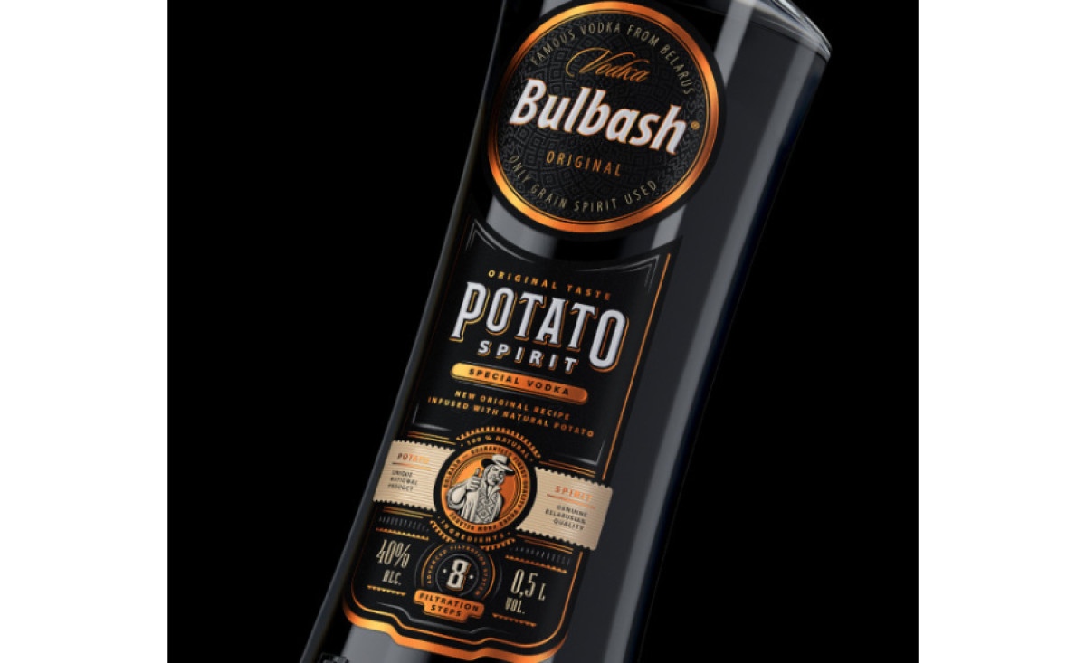
Bulbash Potato is a high-end vodka proud of its cultural origins. Armbrand ensured that these virtues were portrayed in their solution for the brand’s packaging design.
When combined with copper, black provides a sleek and elegant visual appeal to the bottle. The bottle is placed inside a gift package tube of a peculiar oval shape, fitting the subtle industrial aesthetics.
The label leads with a copper circle with the logo design and a typographical blend decorated with traditional, local-culture-inspired patterns with varying opacity. We can see a combination of script, headline italic, and standard sans-serif styles that elevate the label design further.
The lower part of the label features an illustration of a man posing with his thumb up as a customized “seal of quality assurance”. The neck is decorated with an embossed copper pattern, enhancing the label’s appeal.
-preview.jpg)