Standout Features:
- Custom sans-serif wordmark
- Intricate artichoke logo design
- Botanical pattern for a natural touch
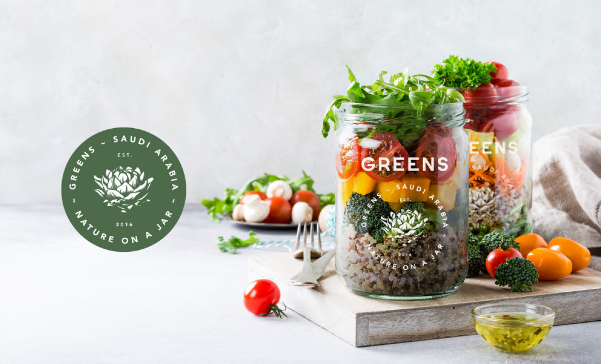
Greens’ branding and packaging, developed by Ādesign, speaks to its commitment to organic, high-quality food products. By blending natural elements with a contemporary style, the design appeals to a health-conscious audience, reflecting the brand’s core values of sustainability and freshness.
A central element of the packaging is the custom sans-serif wordmark. The clean, straightforward typography feels both professional and welcoming.
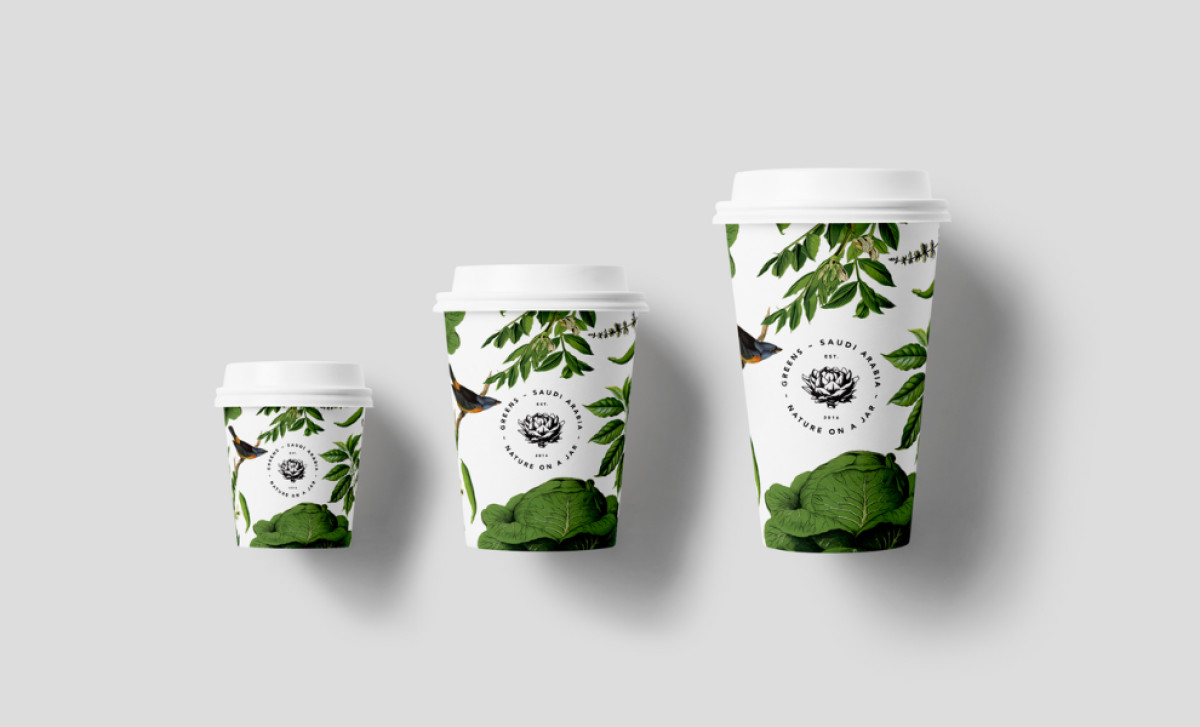
This wordmark pairs beautifully with the intricate artichoke logo, which evokes images of high-quality, fresh produce. The choice of an artichoke as the icon is meaningful, symbolizing nature and healthy food — traits that are core to Greens’ philosophy.
The botanical pattern used throughout the packaging, featuring leaves and other natural motifs, enhances the brand’s organic identity. This illustration creates a texture that reinforces the message of freshness and nature. This pattern not only brings the product to life but also makes everything consistent across different mediums, from packaging to digital platforms.
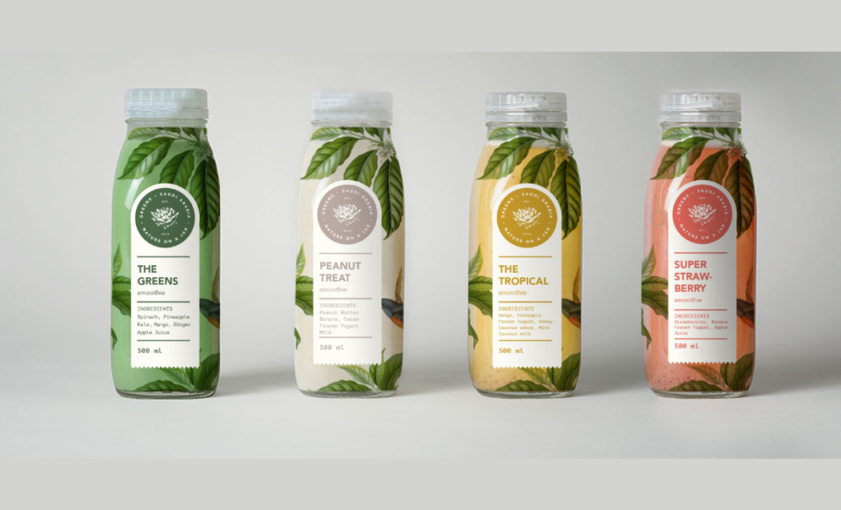
In terms of color, the design embraces shades of green and earthy tones that evoke the concept of natural health. These colors immediately communicate the brand’s commitment to fresh, organic ingredients, and provide a sense of calm and well-being, making the packaging feel inviting.
Overall, Greens’ food and beverage packaging perfectly reflect its mission of providing fresh, organic meals through a cohesive identity. The thoughtful typography, logo design, and botanical illustrations all work to create a memorable, modern brand that emphasizes quality, health, and sustainability.