Standout Features
- Soothing color palette
- Clean and modern typography
- Consumer-centric functionality
Brave World Media, a versatile agency specializing in brand development, teamed up with Calma to create a personal care packaging design exuding simple luxury and a touch of playfulness.
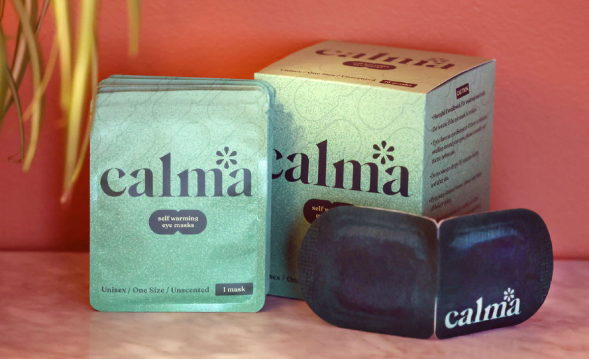
In keeping with the brand name "Calma," the packaging uses a soft mint green color. Colors like this stand out on shelves and suggest a relaxing experience for users, attracting customers seeking comfort.
Moreover, the brand name is prominently displayed in a clean, modern, and legible serif typeface. With ample whitespace and an uncluttered layout, the minimalist design allows the product and its key features to shine. Meanwhile, a playful asterisk detail adds a unique and memorable touch, making the brand name more distinctive!
The packaging's appeal extends beyond aesthetics: it's designed for convenience and functionality. Individual mask packets slip easily into pockets or bags, while the protective boxes maintain their allure.
Finally, the unisex and unscented formula broadens the product's appeal, showcasing the brand's dedication to user-centric design.


