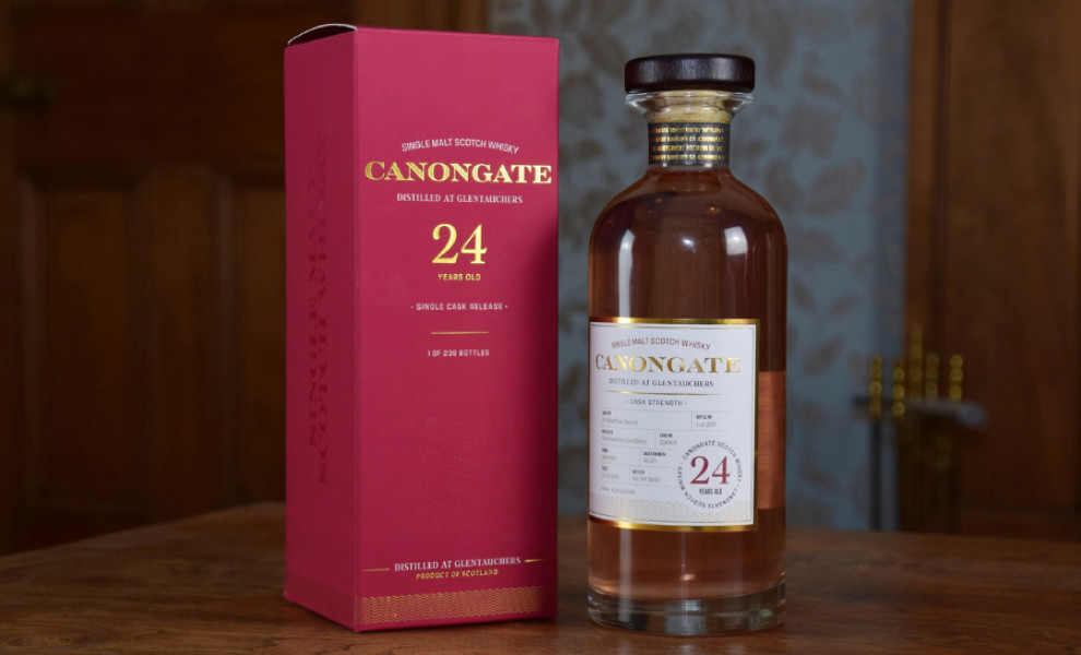
Standout Features:
- Golden hues
- Aging duration stamp
- Separation lines
Hutton Creative Design's sophisticated packaging design for Canongate Whisky represents the product's excellence and the brand's commitment to quality. The golden hues in the packaging exude luxury and quality, effectively conveying the product's premium nature and aligning with the brand's high-end image.
A prominent stamp displaying the aging duration serves as a testament to the whisky's maturity and superior quality. This detail appeals directly to connoisseurs and enthusiasts, who recognize and appreciate the significance of the aging process in whisky production.
Finally, separation lines ensure the layout remains organized and easy to read, which prevents clutter, helping each piece of information stand out independently.