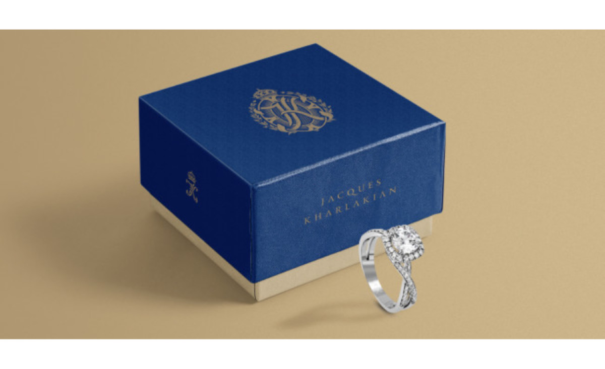
Standout Features:
- Ornate logo
- Sophisticated and elegant
- Royal blue and gold color scheme
Jacques Kharlakian, a distinguished jewelry brand from São Paulo, Brazil, boasts a rich legacy of impeccable craftsmanship and family traditions. INDUSTRIA BRANDING created a packaging design that resonates with the brand’s values and appeals to a refined audience.
Central to this identity is an ornate crest featuring the company's initials, surrounded by regal elements. This, combined with the royal blue and gold color palette, imparts a sense of luxury and exclusivity.
Overall, the packaging design is a testament to the brand’s commitment to luxury and excellence, ensuring customers receive a piece of timeless and well-crafted jewelry. Discover the best jewelry branding examples by delving into our article.
Get a chance to become the next Design Award winner.
SUBMIT YOUR DESIGN