- Article by
- Branko Dimitrijević

#ECC2B5 #3D4973 #000002 #FFFFFF
- Agency: Change/Magic
- Client: Molly Ray Parfums
- Category: Packaging (Fashion & Beauty)
- Location: Seattle, Washington, United States
- Project Brief: Develop a modular, sustainable fragrance packaging system that enables flexible scent differentiation, reduces waste, and supports small-batch production while maintaining a premium, thoughtful brand aesthetic.
Fashion and beauty packaging design demands a precise balance between material restraint and structural clarity to ensure a brand scales without visual fatigue.
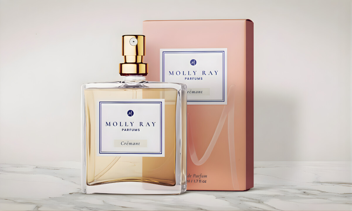
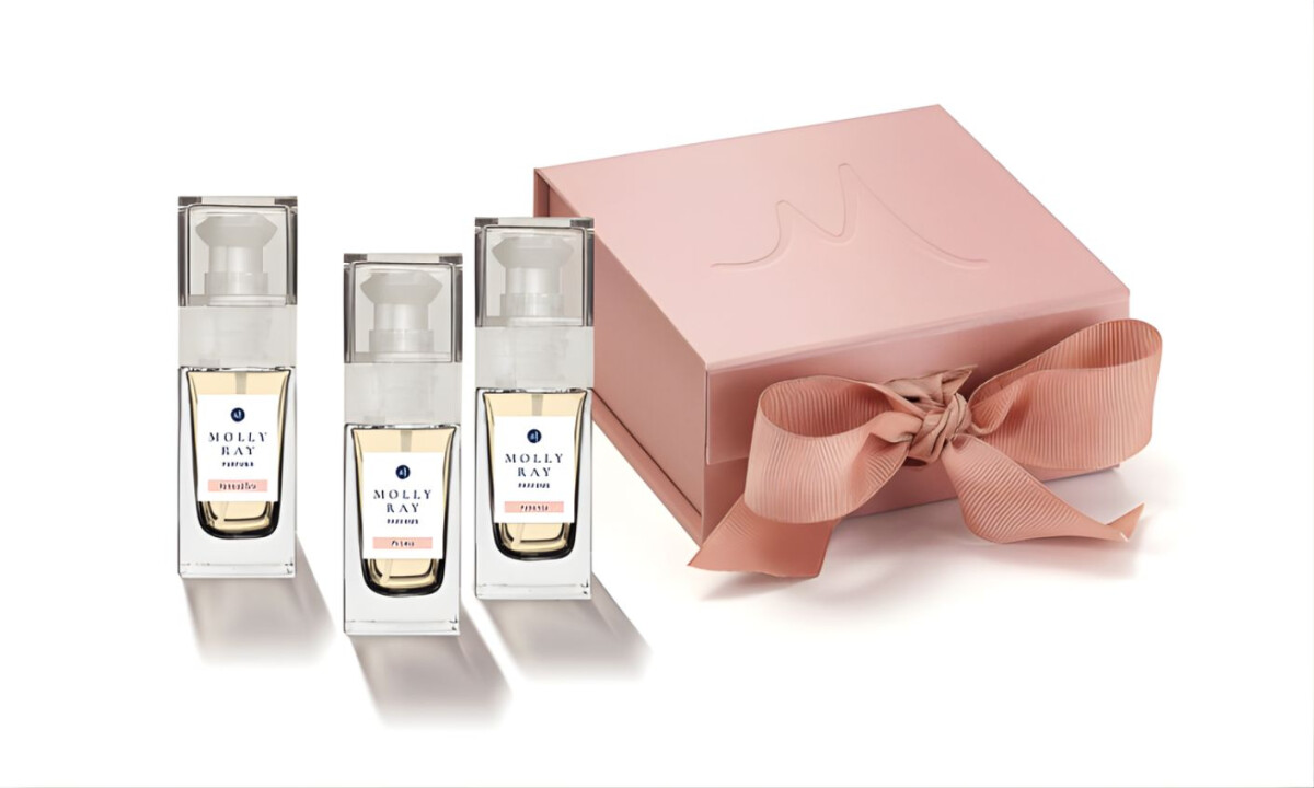
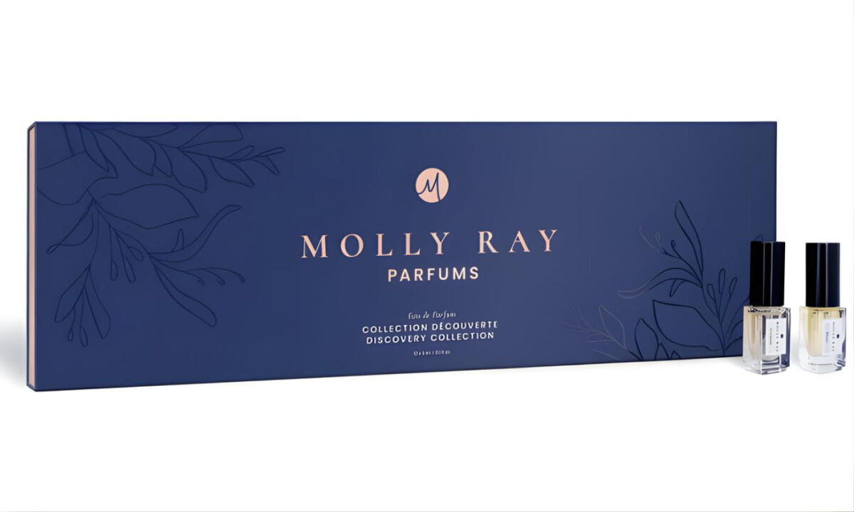
Molly Ray Parfums packaging utilizes a modular framework that proves high-end aesthetics can coexist with sustainable practices and operational efficiency.
- Modular Framework & Flexibility: The use of navy and blush as core foundational colors allows for a wide range of scent-specific identities through simple label variations. This approach is highly effective in my eyes because it provides each fragrance a unique personality without the need for redundant, custom-manufactured box structures.
- Typography & Information Hierarchy: The minimal printed content on the exterior maintains a sense of calm elegance associated with premium fragrance houses. I believe the three-label configuration handles technical differentiation with precision, ensuring the product is easy for me to navigate during both initial discovery and daily use.
- Material Selection & Sustainability: I appreciate the commitment to environmental responsibility through material choices that prioritize durability while reducing the need for overproduction. These decisions reflect a thoughtful brand ethos that aligns with the modern consumer's expectation for responsible, low-waste luxury.
- Brand Expression & Shelf Presence: The restrained color palette and subtle graphic accents provide a refined presence that feels both contemporary and authoritative. I find the final result confident and cohesive, as it allows the fragrance itself to remain the primary focus while still maintaining a distinctive silhouette on the shelf.
What Brands & Designers Can Learn from the Molly Ray Parfums
Here are three key lessons from the Molly Ray Parfums design:
1. Build a Modular System to Support Growth
Using a consistent structural framework with flexible label variations allows new products to launch efficiently. Modular design reduces waste, cost, and visual fatigue while preserving brand cohesion.
2. Use Restraint to Signal Premium Value
Minimal typography and a calm exterior create a sense of confidence and sophistication. Luxury packaging doesn’t need excess detail when hierarchy and proportion are handled with precision.
3. Align Sustainability with Brand Aesthetics
Thoughtful material choices reinforce environmental responsibility without compromising perceived quality. When sustainability is embedded into the system, it strengthens both brand ethics and long-term scalability.
Moctezuma
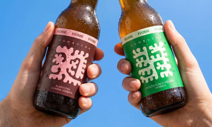
Fooshi
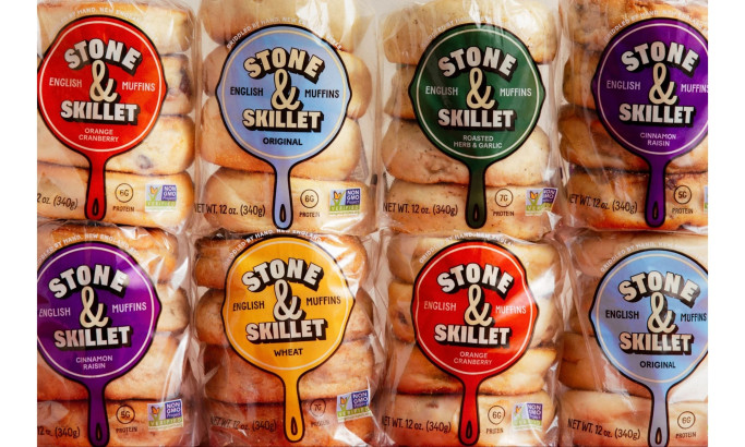
Stone & Skillet
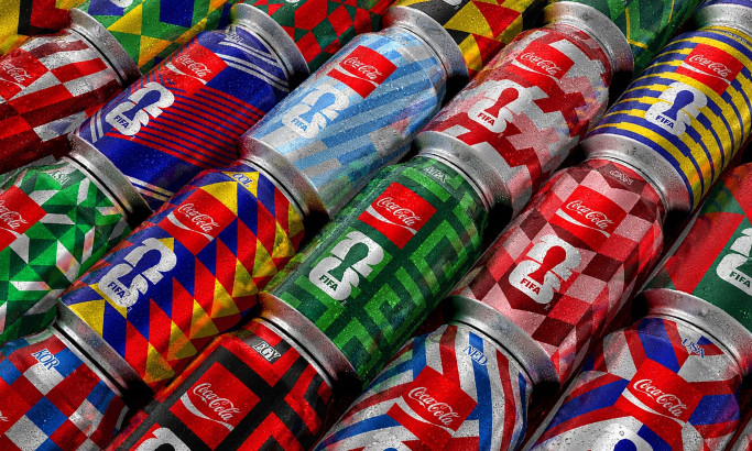
Coca-Cola FIFA World Cup 26 Collectible Country Cans
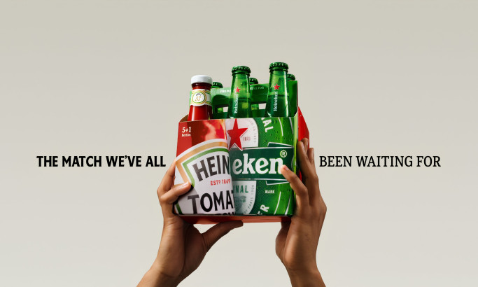
HEINZ x Heineken® Limited Edition Six-Pack
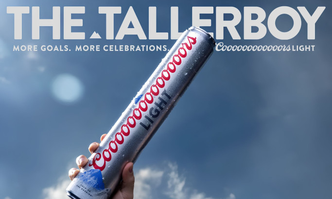
Coors Light Tallerboy
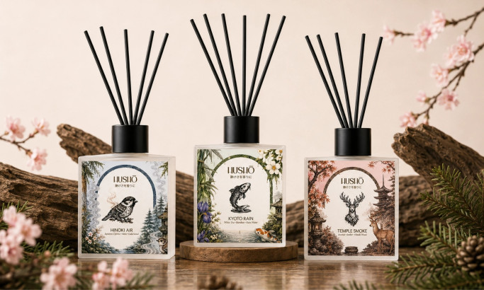
Hushō

Mật Mã Gift Set
