Standout Features:
- Bold numerical coding system
- Vivid, color-coded variant packaging
- Consistent product structure and layout
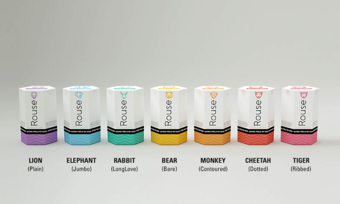
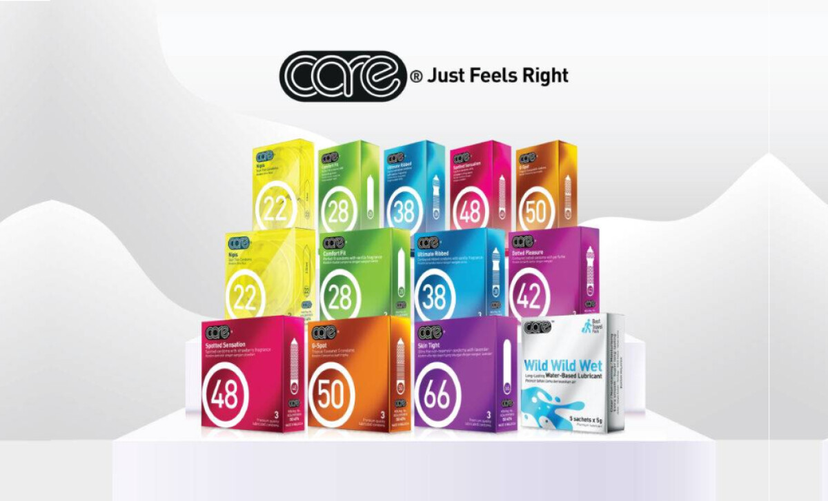
The Care Condom brand takes a systemized approach to design, offering an impressively cohesive product line. Developed in-house by Care Latex, the packaging emphasizes clarity, accessibility, and instant differentiation, ideal for consumers seeking choice without confusion.
Each box prominently displays a large white circle with a variant number, creating an immediate visual anchor. This design choice plays like a hybrid between medical-grade clarity and modern FMCG simplicity, a clever way to instill trust while staying shelf-friendly.
Color also plays a strategic role. From lime green to deep violet, each variant gets its own bold background hue. This vibrant spectrum makes the product line visually striking and easy to navigate, especially for returning customers who associate their preferred experience with a specific shade.
Despite the diversity of offerings, the grid-based structure and logo placement remain identical across the board. This consistency aligns with a 2021 study, which revealed that systematized visual hierarchies (such as numbered labels and consistent layouts) can improve user experience in multi-option product categories.
Care Condoms strikes a fine balance between product utility and eye-catching condom packaging design, making choice simple in an often-overwhelming category.