Standout Features:
- Bold plaid pattern system
- Color-coded product differentiation
- Minimalist, centralized branding block
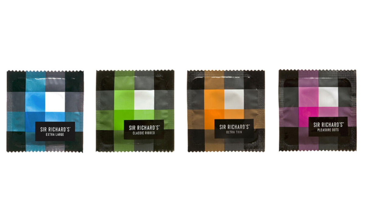
Sir Richard’s packaging breaks away from sexualized design tropes, using bold plaid systems and vibrant color palettes to communicate differentiation. Developed by TDA Advertising & Design, the packaging breaks away from the typical over-sexualized visuals and instead leans on bold design logic. It reflects both functional clarity and confident branding.
Each condom wrapper employs a plaid-based grid system, a surprising and memorable motif in this category. This structured pattern adds familiarity and a fashion-forward quality, contrasting with the often sterile, clinical tone found in similar product lines.
Color plays a critical role in the design, with each product variant assigned a unique, vivid palette. This strategy not only reinforces the product range without relying on extensive text but also transforms the packaging into an intuitive at-a-glance selector.
According to a 2024 report from Straits Research, color-coded packaging can boost product recognition by up to 80% and significantly enhance selection speed.
Anchoring the design is a black square at the center of each wrapper with crisp white sans-serif type. This minimalist label presents the product name and variant without fuss. The central placement and uniform format emphasize brand consistency while giving each product room to express its identity.