Standout Features:
- Playful animal icon system
- Vertical layout with clean minimalism
- Variant-themed color coding
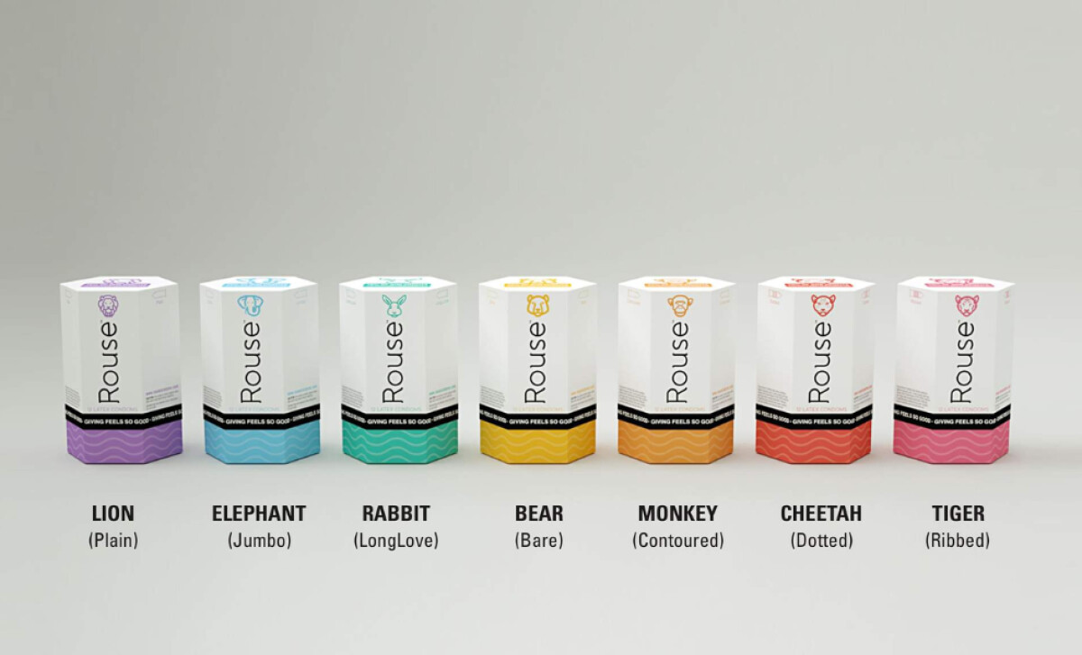
Rouse Condoms isn’t just selling protection, it’s selling personality with purpose. Founded by entrepreneur Scott Petinga, this condom brand turns the category’s clinical stigma on its head by combining tasteful design with a mission for men’s health awareness. The result is lighthearted, approachable, and boldly distinct.
Each product variant features a unique animal mascot, from Rabbit to Tiger, pairing design with function in a fun, memorable way. These illustrated icons go charm and decoration, they foster emotional engagement and aid product recall. A study published in ResearchGate found that brand mascots significantly influence consumer buying behavior by humanizing products and boosting emotional connection, especially in personal care categories.
Design-wise, the boxes maintain a clean vertical orientation, dominated by white space. The typography is sleek, with “Rouse” set vertically to stand out. A black band and the tagline “Giving Feels So Good” add brand consistency, anchoring the otherwise playful visuals with purpose.
Color-coding seals the deal. Each variant uses a different bright hue along the base and animal icon, teal for Rabbit, gold for Bear, red for Cheetah, and so on. This not only adds shelf pop to the condom packaging but also simplifies repeat buying decisions, further reinforcing Rouse’s commitment to clarity and user-friendliness.
Rouse Condoms delivers a charming, mission-driven identity by mixing playful packaging with functional clarity. The design reminds us that even intimate care can be expressive, inclusive, and purposeful.