Standout Features:
- Tongue-in-cheek geyser visual pun
- Interactive, die-cut structural design
- Clever blend of humor and tourism branding
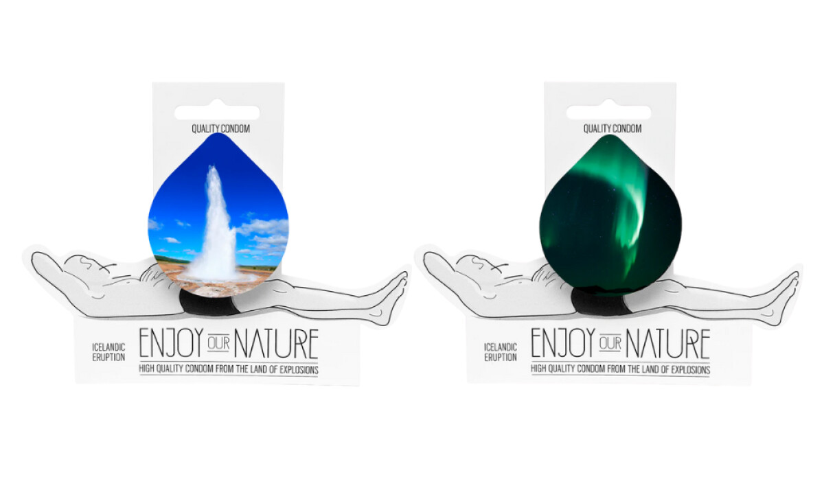
Created by Icelandic designers Fridgerdur and Kristin Birna, the Enjoy Our Nature packaging is part travel ad, part cheeky product marketing. It brilliantly fuses national pride with provocative humor, using Iceland’s natural wonders as a metaphor for sexual energy.
The packaging’s most striking feature is a photo of an erupting geyser, cleverly printed on a teardrop shape and positioned suggestively above a reclining illustrated figure. This forms a visual innuendo that’s unmistakably playful yet tastefully executed. The package design then takes things further with a die-cut layout, positioning the geyser right where it counts.
This attempt at humor is strategic. A 2021 study found that humor in branding significantly boosts brand likability and recall, making designs like this both memorable and market-savvy.
What seals the concept is its headline: “Enjoy Our Nature.” Paired with “High Quality Condom From the Land of Explosions,” it ties together product benefit, brand identity, and national tourism. It’s rare for condom packaging to double as a cultural statement, but this one does, and sticks the landing.
Enjoy Our Nature proves that packaging can spark emotion, conversation, and even wanderlust, all while selling protection. This design is at its most daring and clever, pushing boundaries while staying on brand.