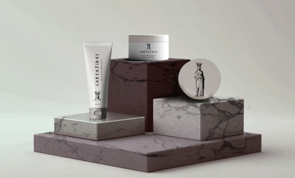
Standout Features:
- Minimalist caryatid illustration
- Greek alphabet typography
- A blend of classic and contemporary aesthetics
CARYATIDES’ packaging design for its beauty products seamlessly blends classical inspiration with contemporary minimalism.
Drawing inspiration from the company's name, Peter Tatsis’ design features an illustration of the iconic pillar sculptures from Ancient Greece, known as caryatids. These figures symbolize strength, grace, and beauty, embodying the brand’s essence.
Another important design element is the font choice, which resembles the Greek alphabet. This Greek-inspired typography reinforces the brand’s identity and resonates with consumers who appreciate both tradition and innovation.
Complementing these elements is the design’s black, white, and gray color palette, which serves to highlight the symbolic pillar and the product itself. This minimalist approach not only evokes a sense of cleanliness and elegance but also aligns with modern aesthetics.


