Standout Features:
- Sleek black can for a premium feel
- Fiery red chili centerpiece
- Elegant typography
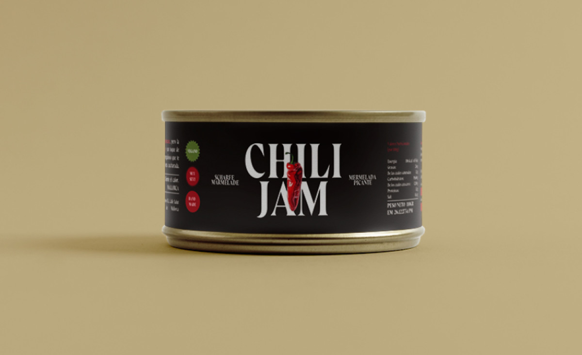
A sleek black can, bold typography, and a fiery red chili — Chili Jam’s packaging is both elegant and intense. Designed by Indigo Estudio, the layout pairs a minimalistic approach with bold visual storytelling, ensuring the product stands out on the shelf while evoking its spicy, gourmet essence.
The sleek black can immediately convey sophistication and exclusivity. The dark matte background provides a striking contrast against the vibrant red accents, reinforcing the product’s premium positioning while evoking the depth of its bold flavors.
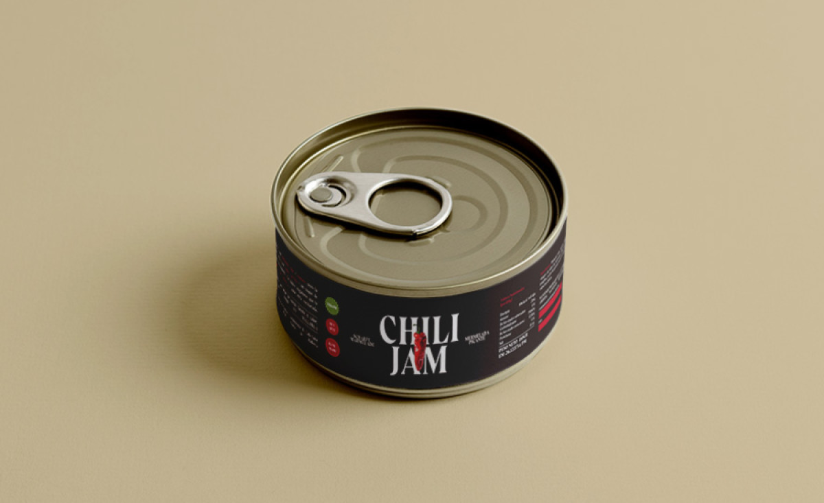
At the heart of the design is the fiery red chili centerpiece, seamlessly integrated into the typography. This visual element not only serves as an eye-catching focal point but also subtly reinforces the product’s heat and intensity, making an instant connection with spice lovers.
Completing the design is elegant typography, which perfectly balances refinement and boldness. The serif font adds a touch of classic sophistication, while the sharp, high-contrast lettering ensures visibility and impact.
Indigo Estudio has successfully crafted a food and beverage packaging design that is both visually compelling and strategically effective. The combination of a minimalist aesthetic with bold focal elements creates a strong brand presence, making Chili Jam an irresistible choice for those seeking a gourmet spicy experience.