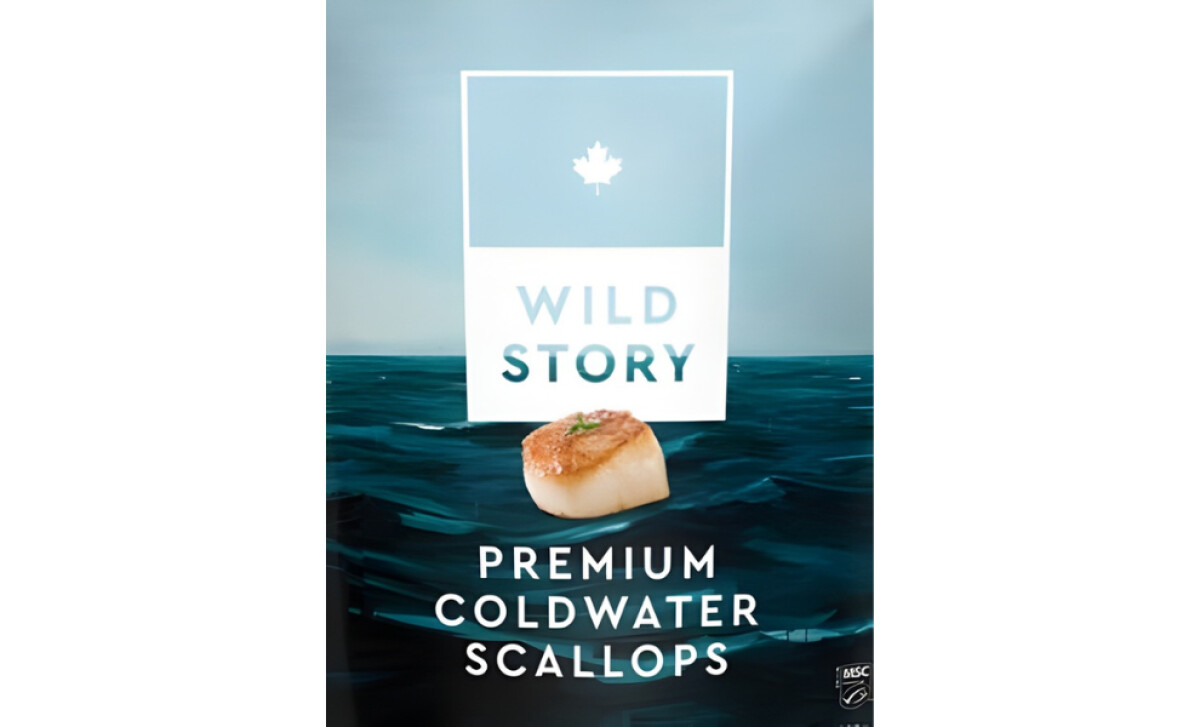
Wild Story, a premium seafood brand rooted in the North Atlantic, specializes in coldwater scallops harvested with care and respect for origin.
To translate that provenance into packaging, Black Book Design Collective developed an art-driven system that celebrates place, culture, and craft. The result is a visually striking, emotionally resonant pack that captures the brand’s maritime story while elevating its shelf presence.
Industry Insight: Visual elements such as color, imagery, and layout account for 93.5% of the variance in consumers’ purchase intentions, confirming that well-crafted packaging design plays a critical role in driving buying decisions.
Key Insights for Brands:
- Expressive seascape visuals build emotional rapport with buyers who value provenance.
- Clean, balanced typography paired with matte textures enhances product prestige.
- Color-coded packs across variants support recognition and impulse shelf decisions.
Hand-Painted Seascapes Turn Packaging Into Storytelling
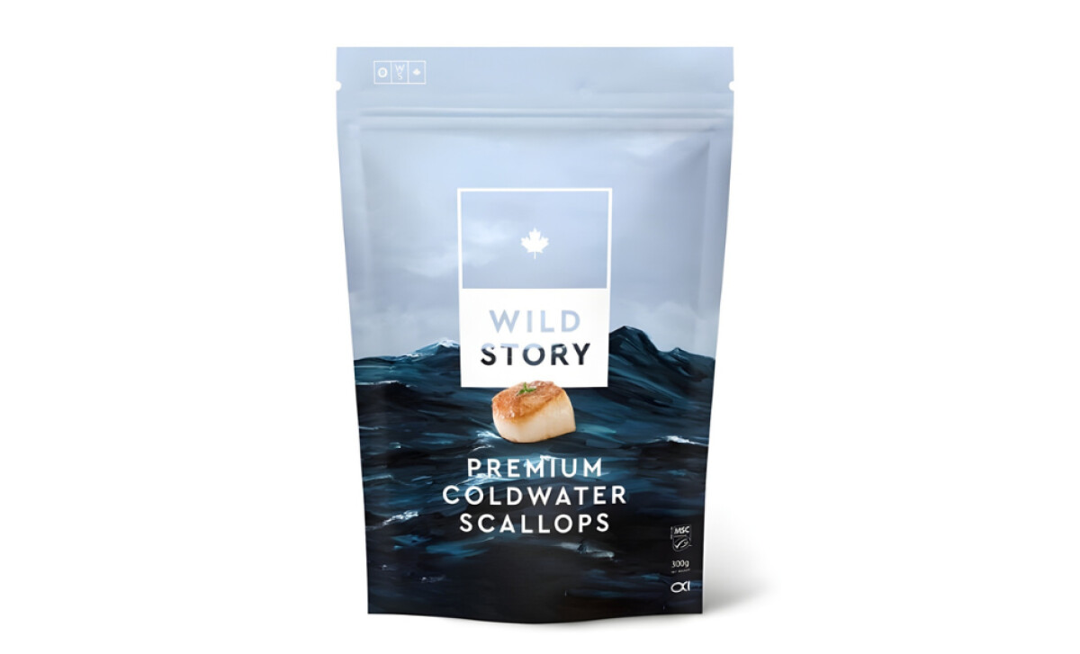
Black Book Design Collective’s packaging design for Wild Story leaves the factory feel at the door. Instead, it opens with a gallery of crashing waves, painted by local hands familiar with the rhythm of the North Atlantic. The brushwork is full of intention and movement. You can almost hear the water.
These visuals work as emotional lures rather than decoration. According to Motista, 71% of consumers are more likely to recommend a brand when they feel emotionally connected to it. This design benefits from that truth.
The painted sea does more than reference a point on a map. It invites the viewer into the atmosphere of the coast. Shape, color, and composition place the buyer inside the story.
Hiring local artists reflects a clear brand philosophy. These images are not stock illustrations but narratives told in oil and pigment, each one anchoring the product in cultural and geographic identity.
Minimalist Typography Enhances Sophistication
There is clarity in the typography that avoids unnecessary flourish. Serif and sans-serif fonts appear with restraint, positioned carefully to let the artwork guide the eye.
The logo and scallop image sit centered in a way that feels crisp and calm.
The restraint has purpose beyond style. White space leads the viewer to focus on what matters, and Loop11 reports that 84% of people prefer simple and clean designs over cluttered layouts, which strengthens first impressions and trust.
The breathing room in this layout becomes a form of hospitality for the eye. Calm sells, and this design understands that.
Resealable Format Balances Form and Function
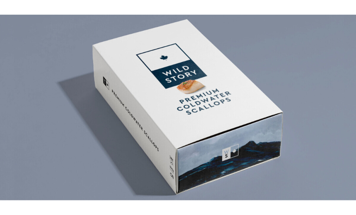
The resealable pouch supports the way real people cook and store food. Open, close, repeat. No scissors. No fuss. The pouch stands upright, which improves both visibility on the shelf and organization in the freezer. The structure supports the story without disrupting it.
Juror Andrea Owsinek-Brucker expressed it clearly:
“Creating a cultural connection using dignified, stunning visuals elevates the brand, and resealable packaging adds to the storytelling and impact.”
The functionality enhances the brand narrative, showing how frozen food packaging designs can be both expressive and engineered for everyday use.
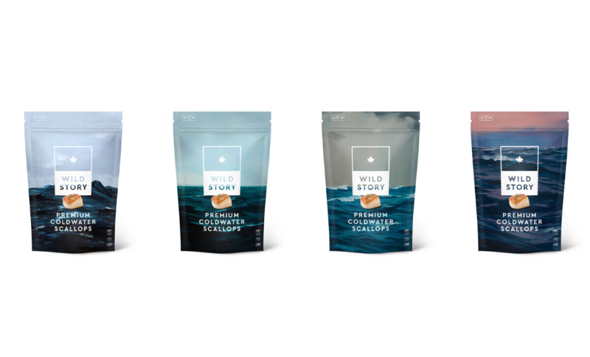
Cohesive Variant Design Aids Shelf Navigation
Across the product line, the design team shifts tone while protecting coherence. Each variant introduces a different seascape mood, from stormy to tranquil, yet all belong to the same visual family.
The color cues guide the shopper with subtlety. This reflects a design truth seen across modern packaging trends. Emotional cues and color psychology drive 90% of first impressions, and Wild Story channels that power effectively.
What Brands & Agencies Can Learn from Wild Story
Wild Story’s packaging reminds us that provenance and artistry can carry just as much weight as logos and labels. It’s the kind of nuanced execution you expect from top packaging design agencies, where every visual cue contributes to a deeper brand narrative.
1. Use Art to Deepen the Story
Hand-painted elements give packaging emotional depth. When visuals come from local artists or real environments, they create a sense of authenticity that can’t be manufactured.
2. Let Typography Serve the Image
Minimal type keeps the artwork in focus. When text feels quiet and intentional, it supports the story rather than competing with it.
3. Build Identity Through Consistency
Unified structure across product variants builds recognition. Color-coded accents and shared textures create range without losing the sense of one cohesive brand.
About DesignRush Featured Designs
At DesignRush, we review hundreds of agency projects each month. The featured designs stand out for creativity, relevance, and execution.
Many go on to be recognized as winners of our Monthly Design Awards.
Explore more creative work here:
- Best Packaging Designs
- Best Website Designs
- Best App Designs
- Best Logo Designs
- Best Print Designs
- Best Video Designs
For a full list of design agencies and related services, see our Agency Directory.