Standout Features:
- Hand-drawn root illustration
- Deep green color palette
- Metallic accents
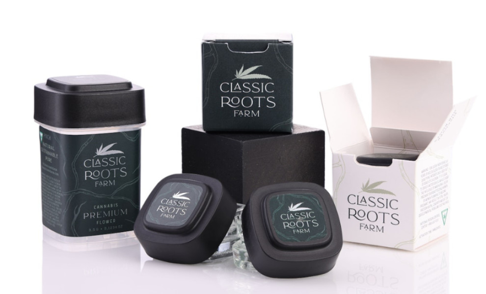
Classic Roots Farm's packaging design embodies the brand's eco-friendly ethos and premium quality through a combination of illustrations, deep green colors, and luxurious accents.
Developed by Ruby Rose, the packaging design features a hand-drawn root illustration that symbolizes the connection to nature and the earth. This element reinforces the organic and natural origins of Classic Roots Farm's cannabis products.
Moreover, the deep green color palette dominates the layout, symbolizing growth and vitality. Green is universally associated with nature, making it an ideal choice for a brand focused on organic and natural ingredients. This color scheme also creates a calming and refreshing visual experience.
Metallic accents complement the lettering and root illustrations to create a sense of luxury, representing the premium quality of the brand's cannabis products.