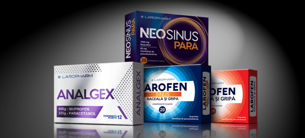
Standout Features:
- Different patterns per variant
- Bold, white lettering
- Active ingredients listed
Laropharm's packaging design grabs attention with a unique layout and color scheme per variant. Remark Studio created this dynamic packaging design, delivering an eye-catching product on pharmacy shelves.
The packaging features bold lettering for the product name that cuts through the vivid background, ensuring the brand and product are immediately noticeable and memorable. This clear typographical choice also aids quick identification by consumers.
Lastly, the active ingredients are listed clearly, showcasing transparency and aiding in informed decision-making for consumers. This move serves both an educational purpose and reinforces the product’s efficacy.
Get a chance to become the next Design Award winner.
SUBMIT YOUR DESIGN